What’s Old is New Again
By Edgar Zuniga
The official release of the 2024 MLS Archive Collection kits on July 16 is a watershed moment for the league, emphasizing that we are way beyond the days when Major League Soccer would release bland Adidas templates with minimalist design that required an entire PowerPoint presentation to explain its nuances.
My “favorite” remains the 2019 Minnesota United FC secondary kit, which was practically a visual representation of Jonah Minnesota walking out to his barn in the middle of a blizzard to milk his polar cow while tiny polar mice scampered across the frozen floor. Alas, there are no such things as polar cows or polar mice, and that was more than I should have written about such an insipid and sterile kit design, of which there were so many between 2018-2022.
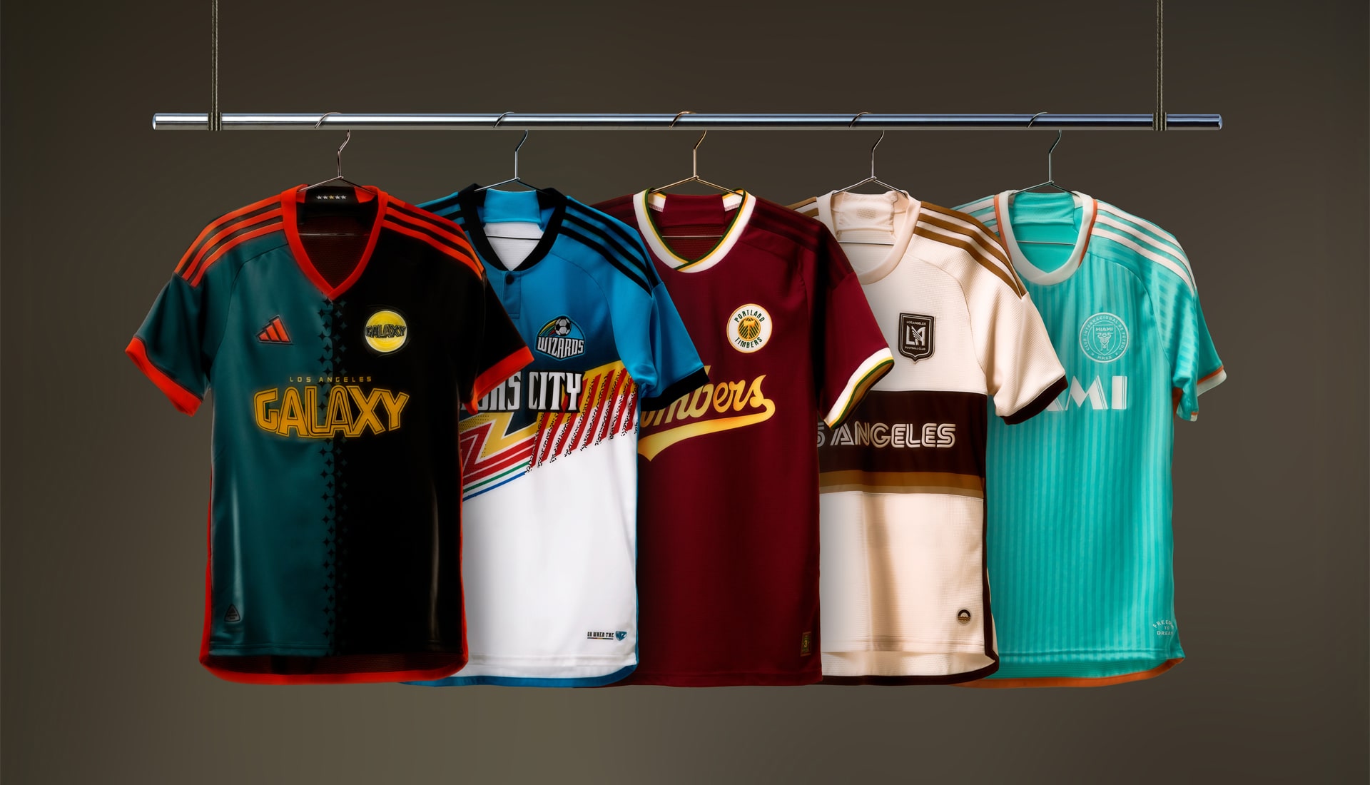
But, as I proclaimed earlier this year, we’re in the midst of an MLS Kit Golden Age and the Archive Collection was quite an achievement, although not without its imperfections. Sadly, this time around, only five teams got the MLS Archive Collection treatment, which has been a matter of much debate, especially when Inter Miami CF and Los Angeles FC enter the conversation. In fairness to all, I reached out to devoted fans and journalists from every team to get their thoughts and gauge their reactions to their team’s respective kit and how they rank the others.
As usual, I will rank each kit based on template, colorway, public reception, and historical connection or significance to the club. Since the theme is throwbacks, bonus points go to those who understood the assignment and delivered sweet nostalgia on a platter.
Keep in mind that none of these are bad at all. Quite the opposite, they are all superlative, but only one stands out above the rest.
5. Inter Miami CF – Uh… Dolphins Kit?
There’s only one reason why Inter Miami was invited to the Archive Collection party, and it has nothing to do with [sarcasm] the club’s long and distinguished history in South Florida or their enduring and amicable relationship with the NFL’s Miami Dolphins [/sarcasm].
We all know why. It begins with Leo and ends with Messi. Inter Miami could have released a half white-half black shirt, splattered the Inter Miami logo in red on the front, called it “My Little Friend,” and it would have sold like crazy—come to think of it, that’s not a bad idea. Hit me up, MLS.
The point is that MLS knows what they have with the Miami Cash Machine and including Inter Miami was… inevitable. There’s a reason why when you visit the Inter Miami website, it’s the only one in all of MLS where the first tab at the top isn’t a link for tickets, club news, or the schedule—it’s for the shop.
First off, Inter Miami didn’t even bother giving this kit a name. Second, the Inter Miami kit isn’t pink, white, or black—colors associated with the club’s brand. Finally, since Inter Miami joined MLS in 2020, there isn’t much of a history for them to invoke.
Unlike other pockets or corners of the US that have soccer history stretching as far back as the early 1820s, it wasn’t until 1971 that southeastern Florida got its first professional team, when the Washington Darts moved to Miami and became the Miami Gatos before renaming to Toros and eventually moving in 1977 to nearby Fort Lauderdale and becoming the iconic Strikers of the North American Soccer League (NASL), who stuck around until 1983.
Top-tier pro soccer returned in 1998 with Miami Fusion F.C., who played at fabled Lockhart Stadium until 2001, when they won the MLS Supporters’ Shield, whereupon they were unceremoniously dissolved in January of 2002.
Inter Miami had several options here, with the ties to the MLS Fusion being almost a no-brainer. They even play in the same stadium (Lockhart was redeveloped into Chase Stadium for Inter Miami between 2019-2020).
No… They went with the NFL team.
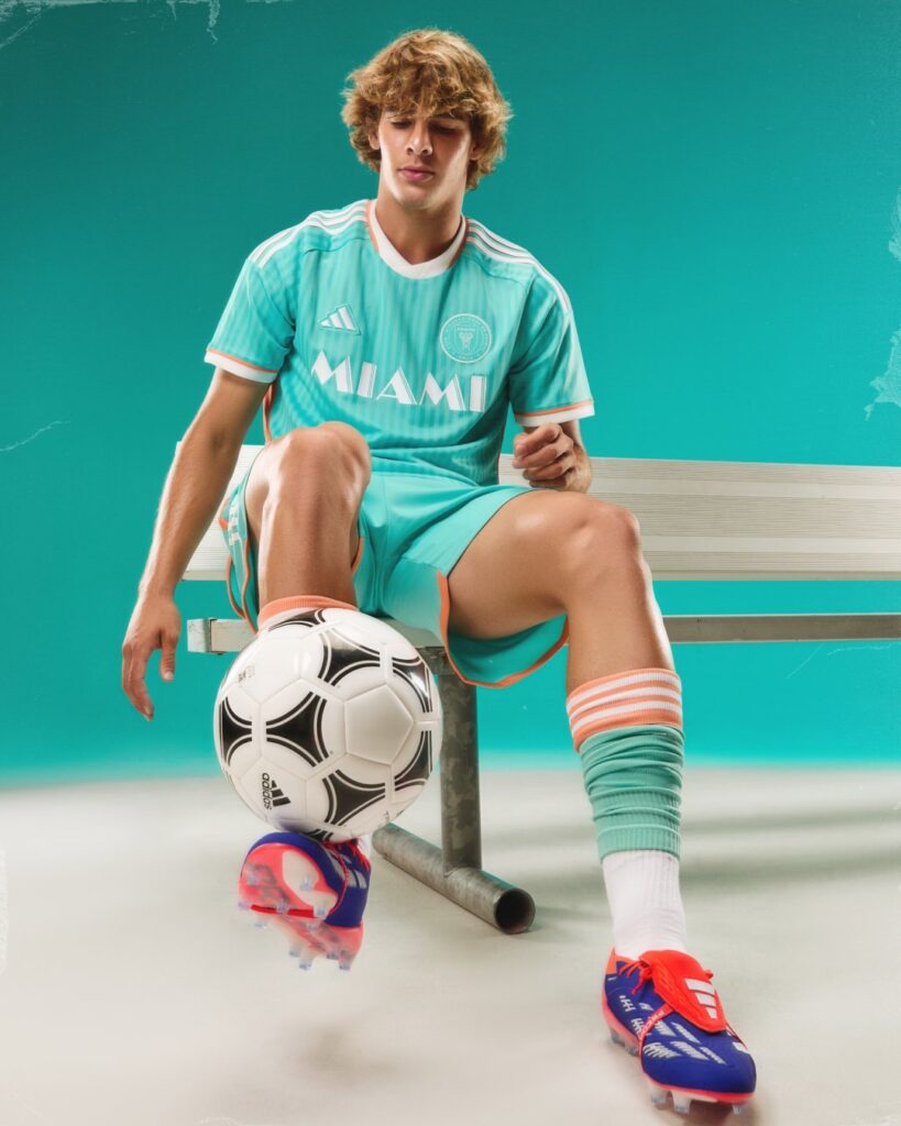
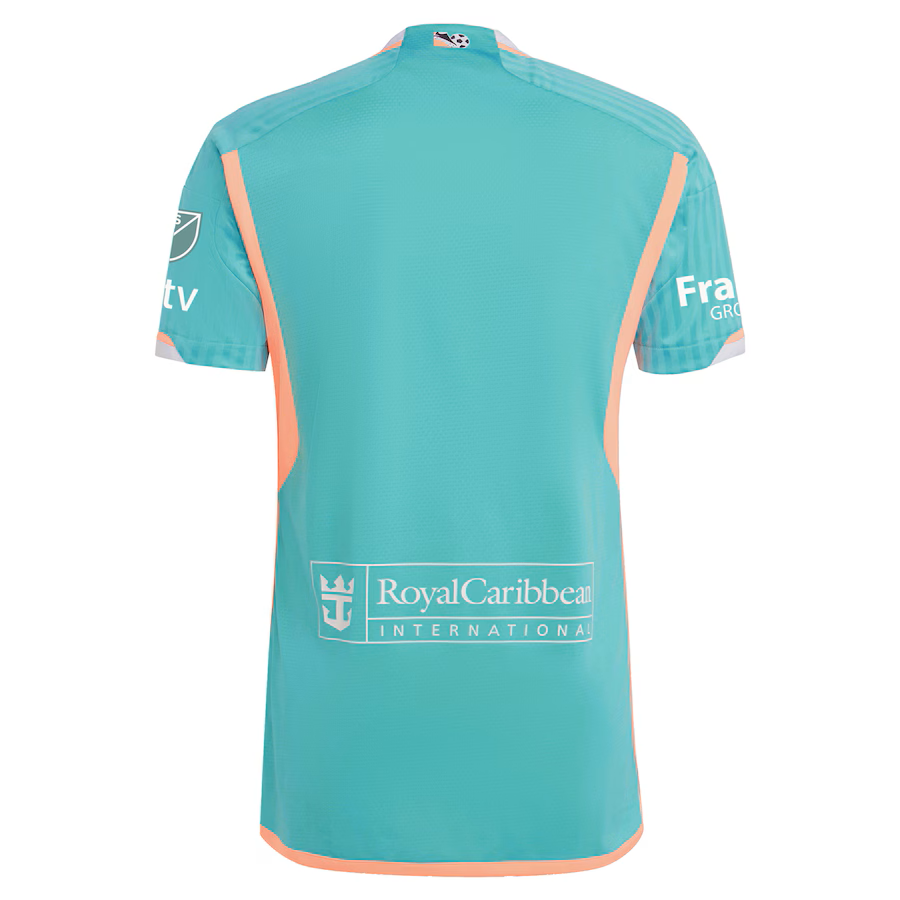
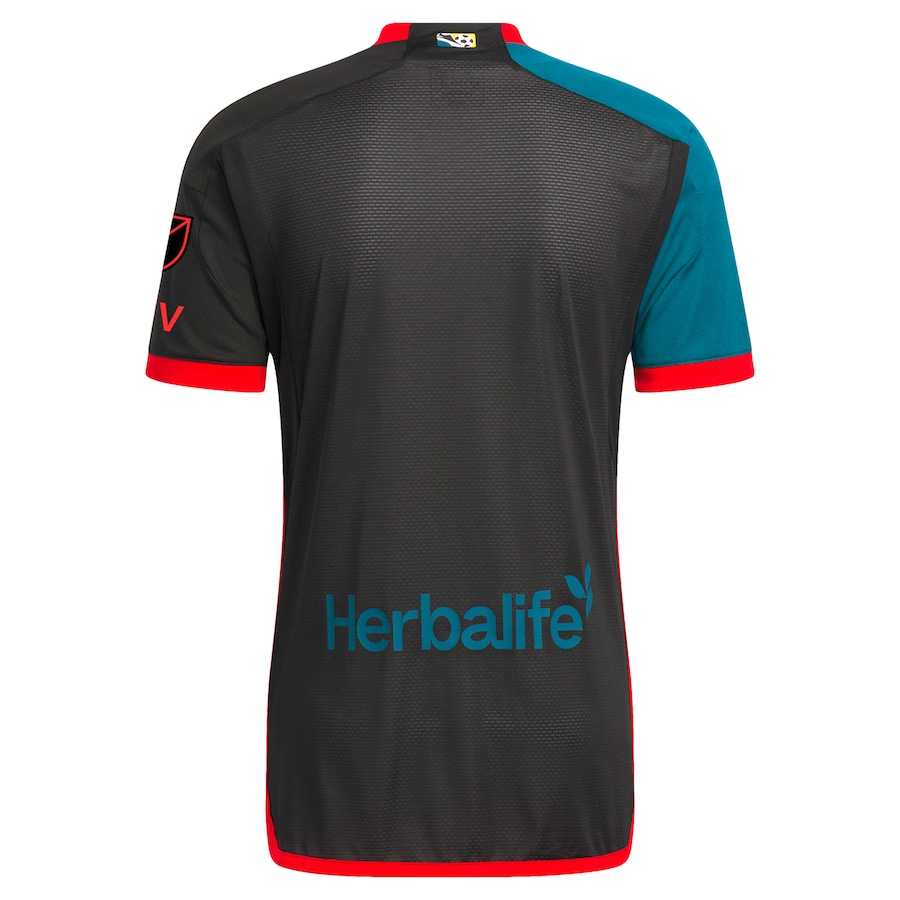
Inter Miami’s new third kit is predominantly sun-bleached aqua in a pinstripe pattern with the Inter Miami badge in all-white on the left and the Adidas logo on the right with “MIAMI” across the chest in an Art Deco font reminiscent of the title card of ’80s legendary crime drama “Miami Vice.” Meanwhile, the club’s “Freedom to Dream” motto returns on the jock tag.
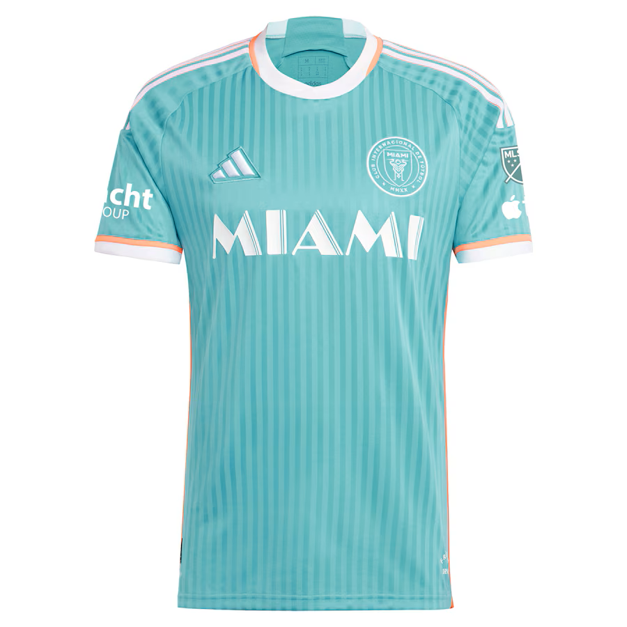
Heightening more of the connection to the Dolphins theme, the kit uses sherbert orange and white on the cuffs and collar, with more orange along the sides and down to the rear hem. The Adidas stripes on the shoulders implement white with orange shading. The oversized Royal Caribbean logo wouldn’t look good on the rear of the kit, so they went with the full “Royal Caribbean International” logo instead.
If you knew nothing about the Miami Dolphins, you would just assume the colors had something to do with the City of Miami (the flag is a tricolor of orange, white, and green) or that it was a callback to the wild ’80s along South Beach.
Daniel (@BatteredFan) from Battered Herons (@BatteredHerons), an Inter Miami podcast, shared his feelings about the kit and addressed the Dolphin in the room.
“My first impression was that I loved it,” he said. “It’s already one of the best kits in Inter Miami’s short history. My favorite part of is that there is no large sponsor across the front but, rather, they put it on the bottom of the back of the kit. I also love the Vice City font used for the Miami across the chest. I wish soccer kits would do this more and find other places to put the sponsors, even though I know that will never happen.”
However, Daniel admitted that he was disappointed when he heard the jersey would be part of a retro collection.
“I understand that they included us in there solely because Messi will help sell those jerseys but if you’re going to group us into this ‘retro’ collection, at least bring back the Fusion colorway,” he said. “We’ve been asking for it for a few years.”
Photo courtesy of the New York Daily News
Daniel added that he was perplexed with the choice to go with a Dolphins-inspired look. The club won’t publicly say it but it’s quite obvious.
“I doubt they will want to say ‘Dolphins,’ especially since Stephen Ross, the owner of the Dolphins, hates Inter Miami,” Daniel pointed out. “We all raised our eyebrows when we heard the rumored Dolphins-inspired theme earlier this year.
“I love the kit,” he added, “but if we were going to go retro it should have been Fusion. Also, the current pink jersey is the worst MLS kit in league history.”
Oof.
Daniel’s ranking:
1. Los Angeles Galaxy
2. Kansas City Wizards
3. Inter Miami CF
4. Los Angeles FC
5. Portland Timbers FC
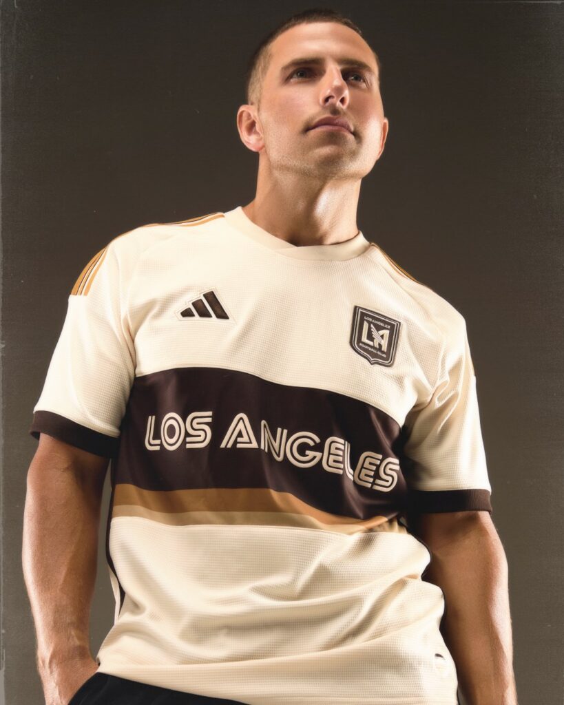
4. Los Angeles FC – Soul to Sol?
Ah, cheese and crackers, here we go again.
Depending on whether or not you’re an LAFC fan, when you heard that LAFC was going to be part of the MLS Archive Collection, you either did the Homelander smile with the nervous laugh, or you sighed deeply and rolled your eyes so far back that the Undertaker’s gong went off somewhere in the background.
Yes, LAFC was invited to the party and while the end result is pretty groovy, baby, there were some mental and marketing gymnastics involved in the launching of their ’70s-inspired retro kits. On their website, they have an article that begins with “Soul to Sol.” That—right there—should have been the name for this kit. I don’t think it has an official name, but let’s just call it “Soul to Sol,” kid.
And guess what? I like it. Another victory for the LAFC marketing team, who once again borrowed something and made it their own with their own style. Upon first impression, anyone that is familiar with the old NASL will immediately react the same way and wonder aloud, “Hey, is this an Aztecs…” Shush now.
This is one of those trendy “What If…” tales you see a lot in films and on TV these days. “What if LAFC had existed in the 1970s?” ponders Patrick Aviles, LAFC’s Vice President of Brand Engagement & Merchandise, on their website. Well, they wouldn’t exist today, just like the Los Angeles Aztecs, from which the new Soul to Sol kit takes heavy inspiration.
LAFC does admit they were inspired by bygone Los Angeles semi-pro clubs like five-time US Open Cup champions Maccabee Los Angeles, who also qualified for the CONCACAF Champions Cup in 1974 and 1978 but withdrew before competing both times. But they wore white kits with light blue trim. Maybe the Los Angeles Wolves from 1967-68? They wore black and gold kits, but that’s too far back.
But take a peek at those Aztecs uniforms and themes from the ’70s, and… yeah. LAFC is being careful to not reach too far, though. LA Galaxy never made any claims for the Aztecs, and neither should LAFC.
Okay, I know what you’re thinking, so let’s get it out of the way. If we’re going to be absolutely fair, LAFC already has a past from which they could draw from *cough*ChivasUSA*cough* but seeing how things ended in their former incarnation, you can’t blame them for not wanting to dig up that old goat.
All that out of the way, the Soul to Sol kit is far out, man. It definitely captures that vibe of sepia-toned, honeydew memories and relaxing on a beach while taking in golden SoCal sunsets. In fact, the base of the kit is a cream color that Adidas calls “linen,” but which could easily be called sandy. The kit is bisected by a thick brown stripe with “LOS ANGELES” across the chest in a smooth Double font (reminiscent of the Aztecs) and two smaller stripes beneath, one in old gold and the other in khaki.
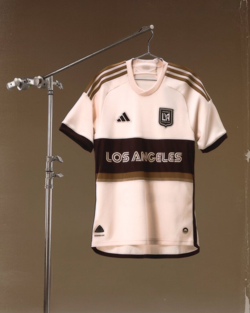
A brown LAFC badge is found on the left with the Adidas logo on the right. More brown is found on the cuffs and along the side piping and down to the rear hem, while the Adidas stripes on the shoulders implement old gold with slight brown shading. You’ll also find a setting sun with waves beneath for the jock tag.
Say what you want, this kit captures that ’70s soul bathed in the golden sol.
“I absolutely love this kit,” gushed Darren Miller (@darrendmiller) of Happy Foot Sad Foot: An LAFC Podcast (@FaFoSaFo). “It’s beautiful. Maybe my favorite of every kit so far.”
However, Darren is quick to admit he’s aware that LAFC doesn’t have much of a catalogue to draw from for the Archive Collection.
“No one’s trying to pretend LAFC has the deep, storied, centuries-long history of other MLS clubs, but it seems like that gave them an opportunity to put more fun and creativity into it than MLS teams normally get to,” he admitted. “Seventies L.A. is an iconic vibe, and they capture it well. Chef’s kiss. With all these Archive Collection kits, it’s HUGE that they were able to put the sponsor on the back. That goes a long way.”
Facts!
Darren also credited LAFC’s branding and kits that he feels you can wear anywhere and show your love for L.A., but this one in particular is a little more special.
“Third kits are always funny cause MLS is so rigid with them, so [this time] it’s like, ‘You guys can have a LITTLE fun, as a treat.’”
Still, as with any of the kits and items in the Archive Collection, get ready to see your see your wallet lose a lot of weight.
“I mean they’re so fucking expensive!” Darren sneered. “I’m sure they’ll sell out quickly, so that’s kind of a double-edged sword. I don’t love that we’re essentially justifying these prices, but it does make it more likely they’ll keep making ’em, I guess.”
Darren’s ranking:
1. Los Angeles FC
2. Portland Timbers FC
3. Kansas City Wizards
4. Inter Miami CF
5. Los Angeles Galaxy
“I think the KC one works way better in the context of today than it did in its day,” he explained. “I think the Dolphins thing is a dumb connection for Miami, but I actually really like that kit in a vacuum, when no one else seems to. The Galaxy kit, rivalry aside—I just don’t like it—but I also think it’s the most subjectively appealing one. Like, I totally see what people who dig it see in it.”
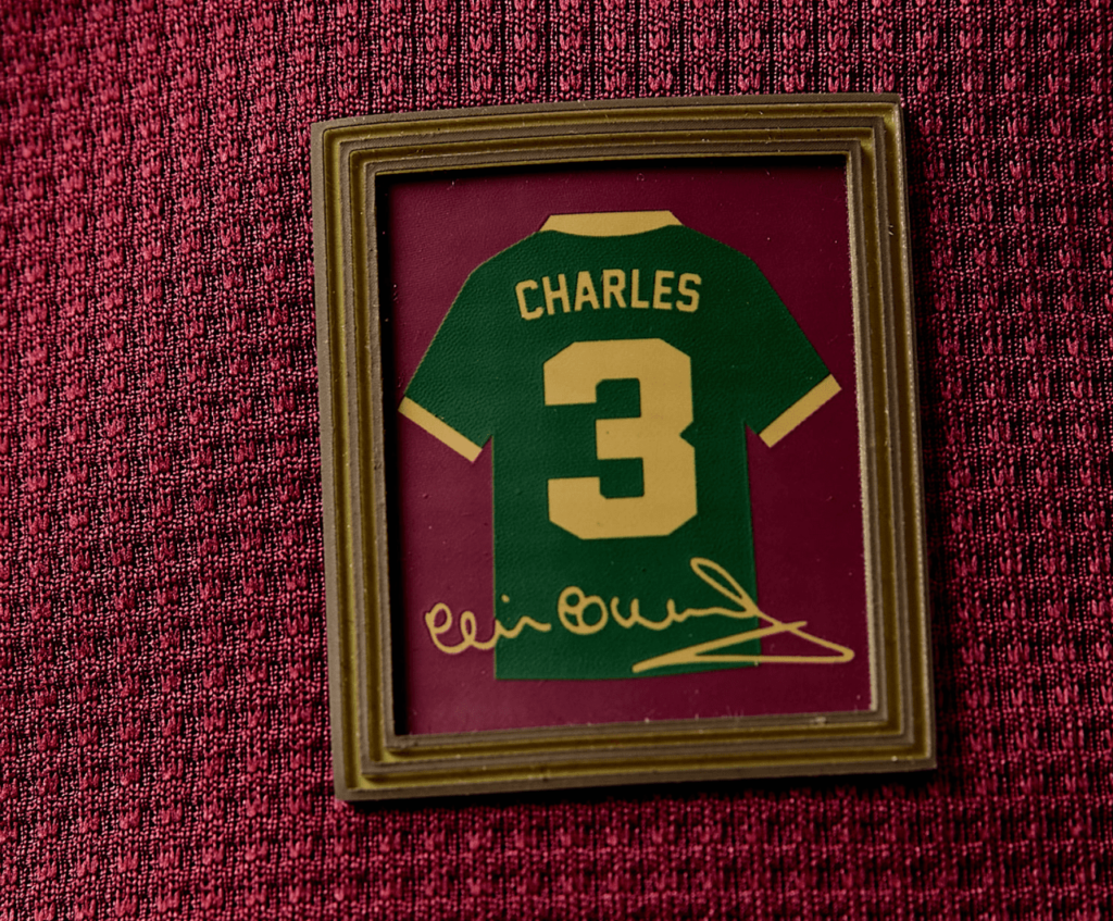
3. Portland Timbers FC – The Clive Kit
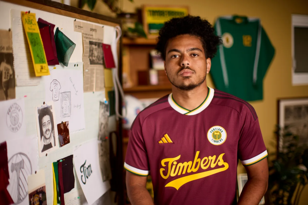
Of the five MLS teams chosen for the MLS Archive Collection treatment, only one of them has a history that actually predates MLS. So, when Portland Timbers got the assignment, they fully embraced it by honoring a footballing legend in Clive Charles.
On April 1, 1972, West Ham United became the first English Football League First Division team to have three black players on the starting 11 when Clyde Best, Ade Coker, and Clive Charles played in a 2-0 win over Tottenham Hotspur at Upton Park.
After a few years with Cardiff City, Charles left for the NASL, playing with Portland from 1978-81 before eventually retiring in 1983 after a season with the Los Angeles Lazers of the Major Indoor Soccer League (MISL).
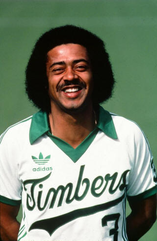
Photo courtesy of the Portland Timbers
Charles had begun coaching while still in England, but his real success came after his playing days in the US. Charles would go on to become an American coaching legend, eventually serving as an assistant with the U.S. Men’s National Team in World Cup ’98 and coaching the U.S. men’s team at the 2000 Summer Olympics, leading the US to first place in their group and a fourth-place overall finish.
He retired from coaching the US U23 men’s national team after the 2000 Olympics, with a record of 23–11–13 (.628). During his tenure, he also coached the US U23s to a bronze medal at the 1999 Pan American Games and third place at the 1997 World University Games.
Before his time with the US U23s, Charles coached the Reynolds High School team in Troutdale, Oregon, for three years before the University of Portland hired him as the men’s soccer coach in 1986.
In 1989, his duties were expanded to the women’s team, and he would continue coaching both the men and women until his untimely death due to prostate cancer in 2003. In his last season with the UP women’s team (2002), they won the NCAA Division I championship.
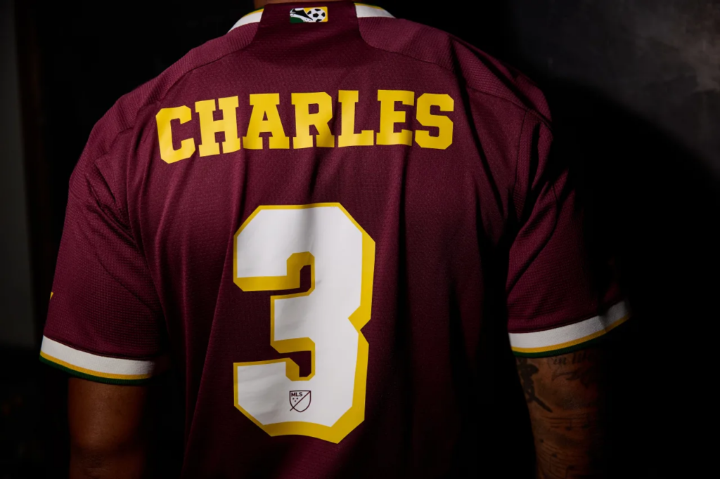
Since then, Charles has been the subject of tifos at Portland’s Providence Park and many articles and documentaries celebrating his life and contributions to soccer in the Pacific Northwest and the US. Shortly after his death, his no. 3 was retired by the Timbers and his name is currently displayed on the Timbers Ring of Honor.
Now, he will be immortalized with a Timbers kit designed and named in his honor.
So why didn’t Portland go with a more traditional green or white kit? According to the Timbers website, maroon symbolizes “passion, love and desire,” as well as representing the influence that Charles had on the City of Roses and West Ham.
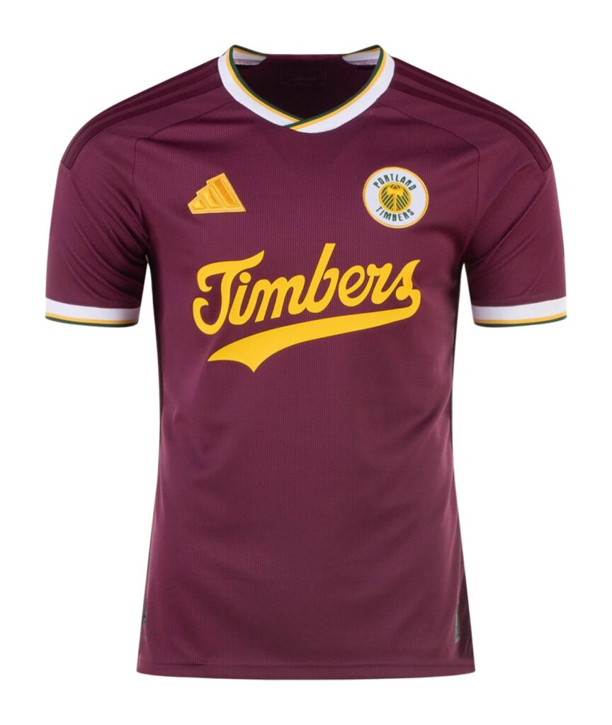
Throwback elements include the Timbers Heritage logo that was used from 1976-80, as well as a Timbers script from their 1981 kit but in gold. More maroon is used for the shoulder Adidas stripes, side piping, and down to the rear hem. Elements of green, white, and gold are used sparingly on the cuffs, collar and on the retro MLS logo on the neck, which give the kit a certain balance.
But the finishing touch is a sublimated framed representation of a vintage Charles Timbers kit with his autograph on the jock tag.
Louis Olenick (@LouisRSOlenick), currently lives in León, Guanajuato and is a co-host of The Lion’s Den Podcast (@TheLionsDenPod), which is dedicated to English-language coverage of Club León of Liga MX, but he grew up in Portland and is a loyal Timbers fan. He respects what the Timbers achieved with The Clive Kit, tapping into their long history.
“Proudly, I can say that the Timbers are the only one of the five [Archive Collection teams] whose history predates MLS,” he said. “The design reflects that, with the classic shield and the same font borrowed from the most iconic jerseys of the NASL days. That’s what I like most about it.”
Although Louis admires the clean design of the kit, he’s not a big fan of the full-on maroon.
“To be honest, I like that color, but it’s not one that’s really associated with the club,” he explained. “I have bad memories of the Timbers playing in any sort of red kits; there have been a few of them over the years.”
Louis also feels that the Timbers should have gone with the classic Adidas trefoil logo found on the 1981 Timbers kit.
“Honestly, they could have done a straight re-release of the ’80-’81 kits or a combination of the two, making the lettering of the ‘81 smaller to fit the shield from the ’80,” he noted.
Louis’s ranking:
1. Portland Timbers FC
2. Los Angeles Galaxy
3. Kansas City Wizards
4. Los Angeles FC
5. Inter Miami CF
2. Sporting Kansas City – Wizards Reimagined
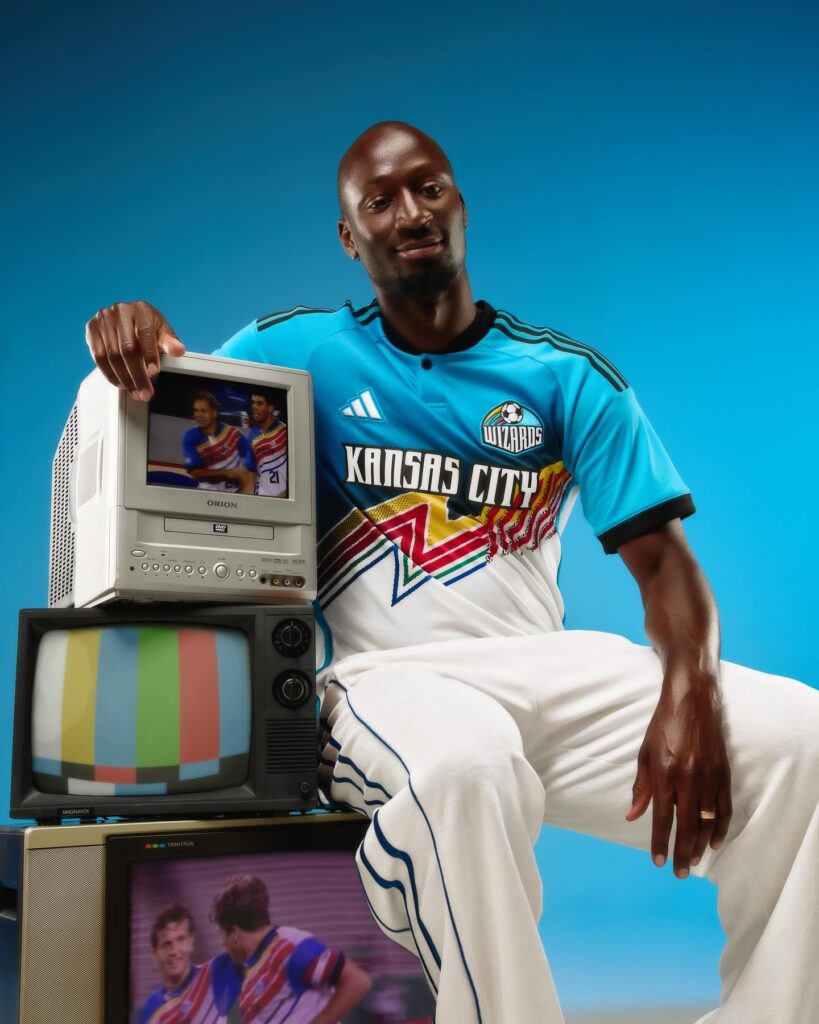
As I stated earlier this year in my 2024 Kit Review, whether it was as the Kansas City Wiz, Wizards, or as Sporting Kansas City, this franchise has had some of the most colorful and memorable kits in MLS history. While the original Wizard of Oz-inspired rainbow kits of their early years were sometimes the subject of ridicule, (like most of the ’96 MLS kits), they have become the stuff of legend and are now considered collectors’ items.
Kansas City was one of the only two MLS Legacy teams to get the Archive Collection treatment, so it was no surprise when they went all the way back to their 1997-98 secondary strip and gave it a modern spin.
You wanna talk about a glow-up…
For the sake of this sick new throwback kit, let’s refer to the team as the Kansas City Wizards. The shirt itself may not have an official name, but it’s definitely the “Wizards Reimagined.” Similar to its inspiration, the top half of the new kit is a bright shade of blue, and the bottom is white.
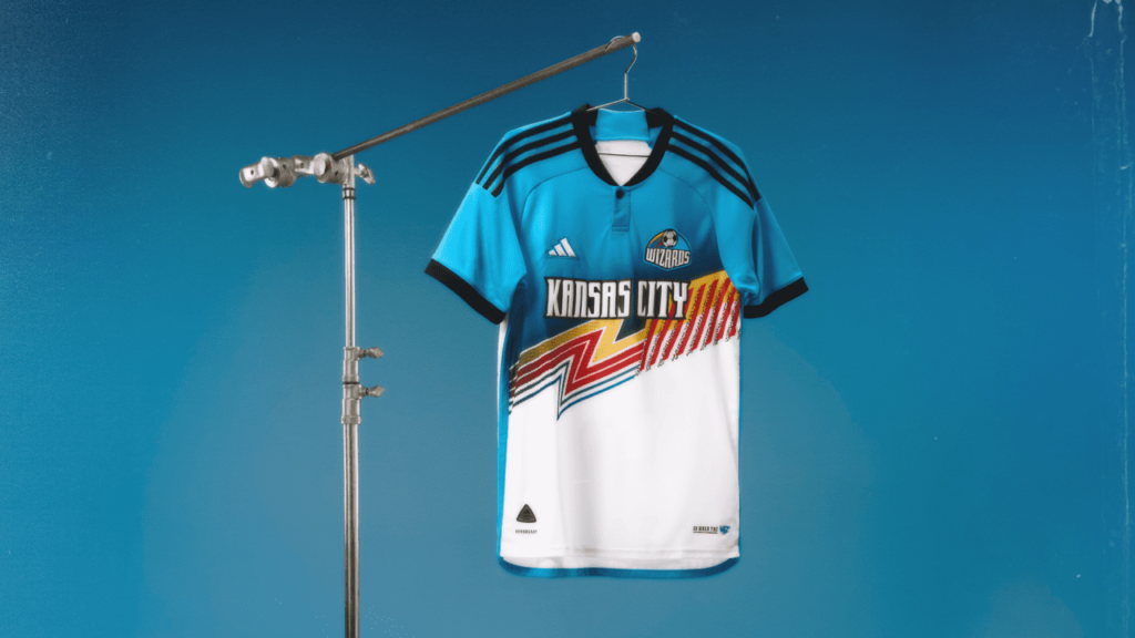
But instead of bringing back the original undulating yellow, red, green, and blue waves that bisect the shirt, the Wizards Reimagined kit condensed those elements into a sharp zig-zagging bolt that flies across the front of the shirt and ends in what can only be described as one of those funky, psychedelic designs you’d find on a Designer Series Trapper Keeper from the mid-’90s.
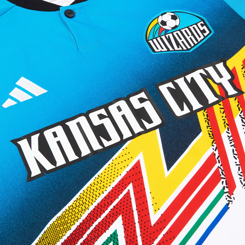
Just that, right there, is a great dose of nostalgia. However, the rest of the kit is just as superb with the old-school “KANSAS CITY” wordmark presented front and center in white with a black border. The iconic Wizards logo used between 1997-2006 makes another triumphant return after a brief but celebrated cameo on the 2018 SKC Third Kit.
Bright blue cascades along the side piping and down to the rear hem. Black, which offers a sharp contrast to the blue, is used on the cuffs, collar, and shoulder stripes. Meanwhile, the jock tag has the phrase “ON WHEN THE” followed by a condensed version of the Wiz logo from 1996 over a thin spectrum band.
Overall, it is visually stunning and, like the Los Angeles Galaxy “RetroGrade” kit, nailed the essence of what an MLS Archive Collection should be with flying colors.
Jimmy Mack (@jcmack03), co-host of No Other Pod (@NoOtherPod) on the KC Sports Network thinks the new Wizards throwback is absolutely incredible.
“In fact, it might be the single best thing Sporting KC has done in 2024,” he remarked. “Initial reactions from fans were universally positive, with many calling for it to be a permanent fixture in the locker room before it even made its first game appearance.”
Jimmy echoes the sentiment that it does a brilliant job of channeling the classic Wizards feel from the ’90s.
“What don’t I like? Honestly, that it probably will only be around for the remainder of 2024,” he lamented. “A jersey this good deserves a longer shelf life, and if the league lets them, Sporting should keep this one around for as long as they can.”
How does it compare to the original that inspired it?
“It may not be quite at the same level of the original ’96-’97 jerseys or the rainbow Wizards jerseys that followed over the next few years, but it sure is close,” Jimmy conceded. “It may honestly be the best SKC kit that has been released in years.”
Jimmy’s ranking:
1. Kansas City Wizards
2. Los Angeles Galaxy
3. Portland Timbers FC
4. Los Angeles FC
5. Inter Miami CF
“I actually really do like the LAFC jersey,” Jimmy admitted, “but on principle I’m putting LAFC and Miami behind the other teams that have more of an actual history.”
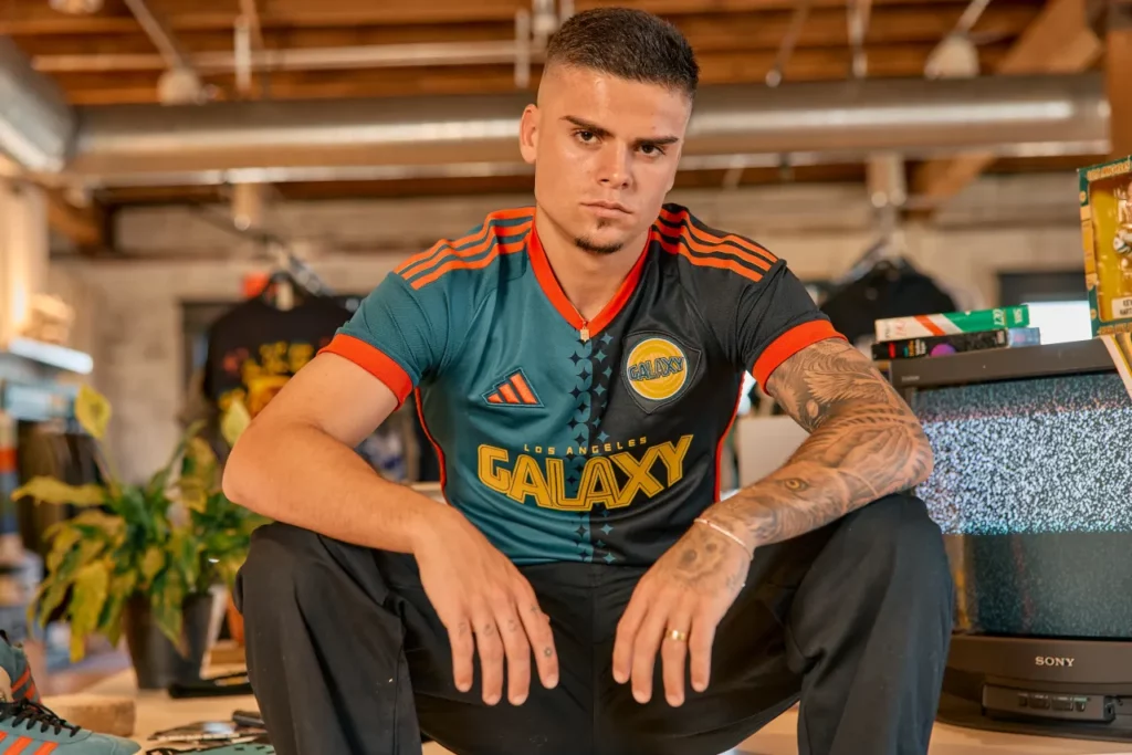
1. Los Angeles Galaxy – The RetroGrade Kit
Maybe we’ll never know but one can imagine that the catalyst for the MLS Archive Collection involved Los Angeles Galaxy exploring the idea of bringing back an updated version of their legendary ’96 home kit only to have someone in an MLS office punt the idea to a broader project.
To say that the ’21 “Community Kit”—a modern version of the ’97 home strip—was a design and marketing triumph in every aspect is an understatement. Players and fans loved the Community Kit, and it even attained global recognition as one of the best in the world upon its launch. Since then, there was a mesh Mitchell & Ness 25th anniversary throwback that was almost identical to the OG ’96, but it was more for the fans and would never see the field of play.
Galaxy somewhat hinted at a 2000-’02 tribute with introduction of the ’22 “City of Dreams” kit, which attained general acclaim by the Galaxy community, but it became its own thing.
Then, the whispers began and rumors of third kits for certain MLS teams that met certain criteria circulated. It wasn’t the first time MLS and Adidas had done something similar, but this time it felt different.
Then the mockups started floating around and there was growing anticipation. This was really happening, wasn’t it? But, how accurate would it be? What about the front of the kit? Oh, the sponsors were being relegated to the lower back, like in the original MLS kits? Cool.
Meanwhile, in early ’24, Galaxy unveiled their primary for the next two seasons, the decent but underwhelming “Angeleno Kit.” It was nothing special, to be honest.
Flash forward to the 4th of July match between LAFC and Los Angeles Galaxy at the Rose Bowl and the cat was finally out of the bag as guest DJ Afrojack was seen wearing the new Galaxy third kit, and the excitement boiled over.
The future is present.
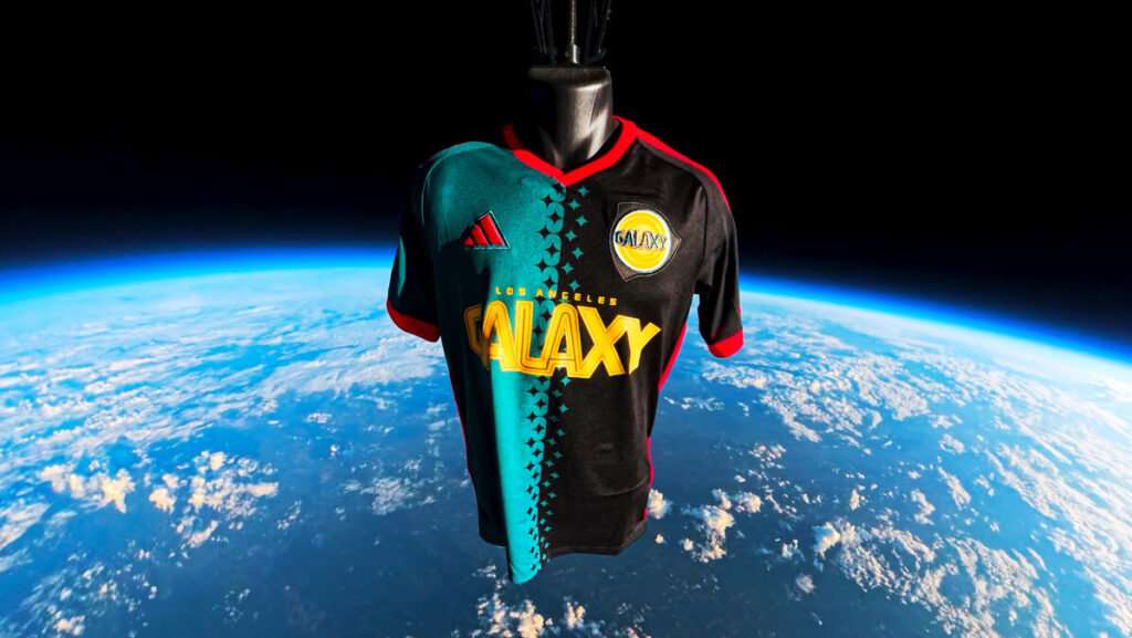
They literally launched it into space. The day of the official unveiling of the new third kit, dubbed the “RetroGrade Kit,” fans lined up at the team store at Dignity Health Sports Park to get theirs at 10 a.m. Meanwhile, the team posted a video on all their social media channels of a ’96 OG Mauricio Cienfuegos jersey and the new RetroGrade Kit (along with several other ones packed along as cargo) getting launched into low orbit (120,000 ft. of elevation). Now that’s what you call a kit launch.
The response from fans was immediate and within the first week, the RetroGrade kit sold more units than all the other third kits combined.
Although it doesn’t replicate all the design elements of the OG ’96, it offers a fresh, bold new reimagining of a classic to become an instant masterpiece of its own. Superlatives all around.
Like the OG ’96, the RetroGrade Kit is a split design, with one half being a similar shade of dark teal green and the other black. Unlike the original, which is split by a serrated design, the RetroGrade kit did something novel, incorporating small Galaxy quasars along the split, creating a similar but more emphatic design element, linking the past with the present.
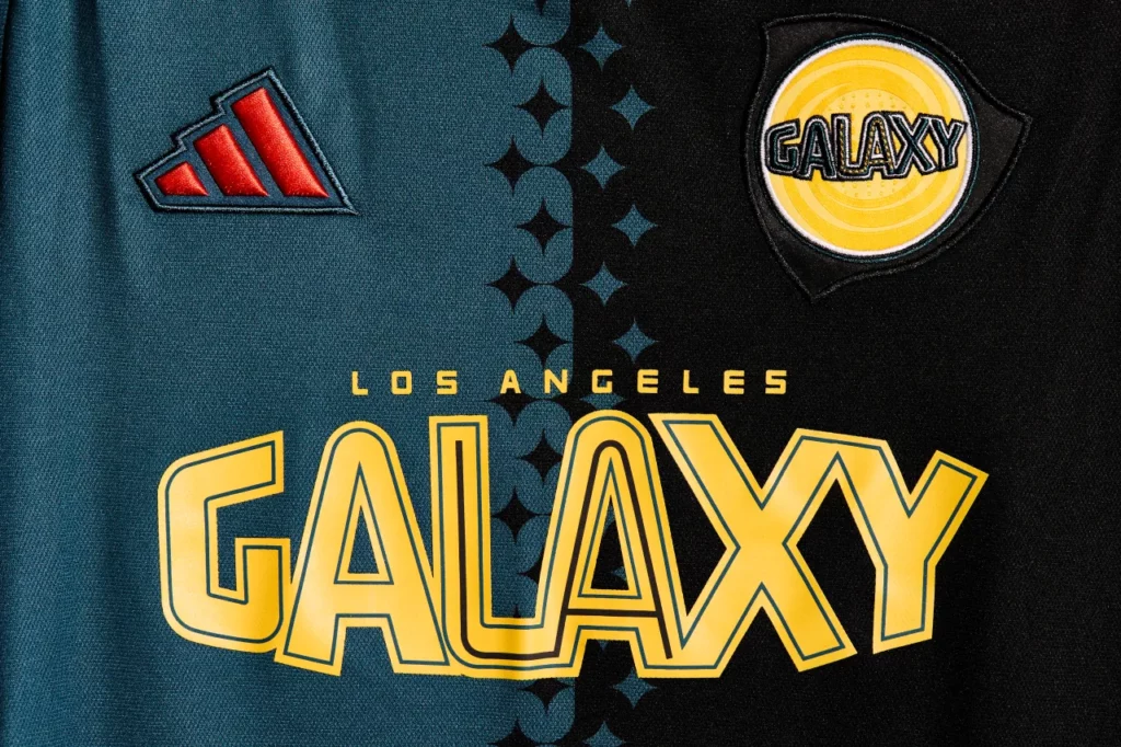
The original Galaxy logo is found on the left of the chest, although it’s not the original that was used from 1996-2002, but a brighter version from 2003-2006. Across the other side is the Adidas logo in a very bold red, which is also found on the collar, cuffs, and on the side piping down to the rear hem, while more of the bold red (with a slight gold outline) is used on the Adidas shoulder stripes.
For anyone wondering if the RetroGrade Kit would include the five stars for the club’s five MLS Cup victories, they are not over the logo but rather on the nape of the neck, so they’re there but nobody can see them when you’re wearing the shirt.
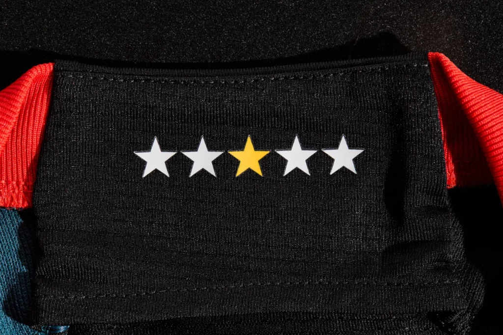
Regardless, the most striking aspect is the return of the original Los Angeles Galaxy wordmark across the chest, large and in gold.
For anyone that watched Galaxy play in their inaugural season, it must’ve been eerie and a bit mind-blowing to once again see Galaxy players back in teal and black, when Galaxy hosted Colorado Rapids a day after the kit launch on a ‘90s-themed night.
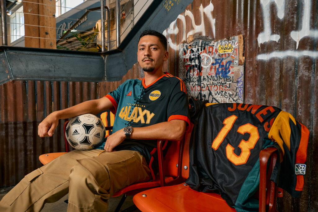
Since then, the kit has quickly become a fan-favorite, a sentiment shared by Galaxy fans Ben Faith (@stringbean670) and Chris Tucker (@ZeroCool138), who also happens to be co-host of The Squadcast (@Squadcast96).
“In general, I like the kit. I think it’s a pretty good design for a faux ’96 kit,” Chris admitted.
“I like it a lot,” Ben said. “I really like the quasar details where the teal and black meet, however, I’m not a huge fan of the fact the teal doesn’t extend around the back [like in the ’96 OG]. I can’t really rank it off the top of my head, but it’s probably not better than the Community Kit.”
However, they both expressed displeasure with the star placement on the shirt.
“I think they should’ve had the stars in a circle around the logo,” Ben said.
“I didn’t agree with the star placement,” Chris declared. “There are five stars on the nape to represent the five titles. I appreciate them finding a way to get them on the shirt, but it seems like a matter of overcomplicating a relatively simple aspect of a jersey design. Stars go above the crest.”
Nevertheless, the RetroGrade kit has proven once again that, served with care, nostalgia sells, and it will go down as one of the best kits in Los Angeles Galaxy and MLS history.
Chris’s ranking:
1. Los Angeles Galaxy
2. Inter Miami CF
3. Portland Timbers FC
4. Los Angeles FC
5. Kansas City Wizards
“The Kansas City jersey is worse, but LAFC have wasted an attempt at a ‘heritage’ jersey they never wore that doesn’t actually have any connection to their club,” Chris stressed.
Ben’s ranking:
1. Los Angeles Galaxy
2. Kansas City Wizards
3. Inter Miami CF
4. Portland Timbers FC
5. Los Angeles FC
The Future
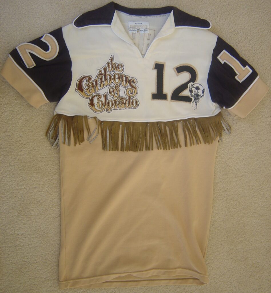
Why stop with these five teams when there are so many others who have had fantastic and unique designs over the years, especially the MLS Legacy teams? Who wouldn’t want to see modern adaptations of the ’96 Columbus Crew, San Jose Clash, and MetroStars primary kits or the ’97 Dallas Burn primary and New England Revolution third kits? What if Colorado Rapids tapped into the local history and brought back in earnest the quaint ’78 Caribous of Colorado kit, fringe and all!
Okay, maybe that’s a tad too much.
Here’s hoping that we get to see the current batch of Archive Collection kits stick around a bit longer and more teams join the party next season!
(All images are the property of Major League Soccer, unless otherwise specified.)
2 thoughts on “What’s Old is New Again”
Leave a Reply
Related Post

The 2023 MLS Kit Renaissance, Part 2
By Edgar Zuniga After reviewing some less desirable designs ranked no. 30 – 21, we [...]
2020 Galaxy Preview
NAG’s Galaxy 2020 Preview As Hans Zimmer’s new Major League Soccer anthem was blasting through [...]
Great story. Truly insightful and entertaining. Sharing with my friends.
Great Article! Like the details to educate on history.