The 2025 MLS Kit Bronze Age
By Edgar Zuniga
We were spoiled with all the gorgeous uniforms released by MLS the last three seasons. It was truly a golden age of artistic, eye-catching, and innovative designs. And, when you factor in the five awesome Archive Collection kits that were released in the late summer of ’24, I was really hopeful they would keep it going for 2025.
Yeah, that wasn’t the case. Adidas forced clubs to use a really clunky template for the new MLS kits that works sometimes but more often does not, and which is a huge detriment to the overall themes and designs of some of the 2025 kits.
With the addition of expansion side San Diego FC for 2025, we got two new kits for them, while (for Messi reasons) Inter Miami CF decided to scrap both of their kits for two new offerings for a total of 32 new kits. Sadly, only a handful classify as spectacular.
Truth be told, there was such a dramatic drop in the overall quality of kit design across MLS that we have skipped the Silver Age and crashed all the way down to the Bronze Age. There are some real stinkers and some experiments that just missed the mark, but there are still some exceptionally beautiful and ingenious designs.
There are several factors that go into my kit reviews and ranks:
- Initial reaction
- Does the kit have any ties to club culture or traditions? If so, how are they incorporated into the design?
- Does the design evoke pride in the club, or does it feel generic?
- How does it compare to previous kits?
- How does it place among the best or worst?
As in previous years, I have asked many friends and colleagues from around MLS fan media to contribute their thoughts and reactions to the new kits, and new for 2025, I also asked them to rate their top 5 and bottom 5 and will include their average rank in comparison to mine. Like music and art, kit design is very subjective and in some cases the MLS fan media rank contradicted mine, which adds a bit of spice and controversy to this year’s list.
Without further ado, let’s get into it!
(My rank / MLS fan media rank)
32 / 29 Red Bull New York – Stone Kit

Here’s a club from a region of the country with a deep and colorful history of American footie that has a solid color palette and represents the biggest media market in North America, and the best they can do is release this surplus store bargain basement bin duck season digital camo mess? It’s almost as bad as the ugly, oil-stained Daniel Patrick Kit from 2023-24. Actually, it could be worse.
Details include the now traditional “NEW YORK Red Bulls” moniker on the lower back of the shirt, while the jock tag is what seems to be a stenciled “NY” with “NEW YORK R.B. 96” below.
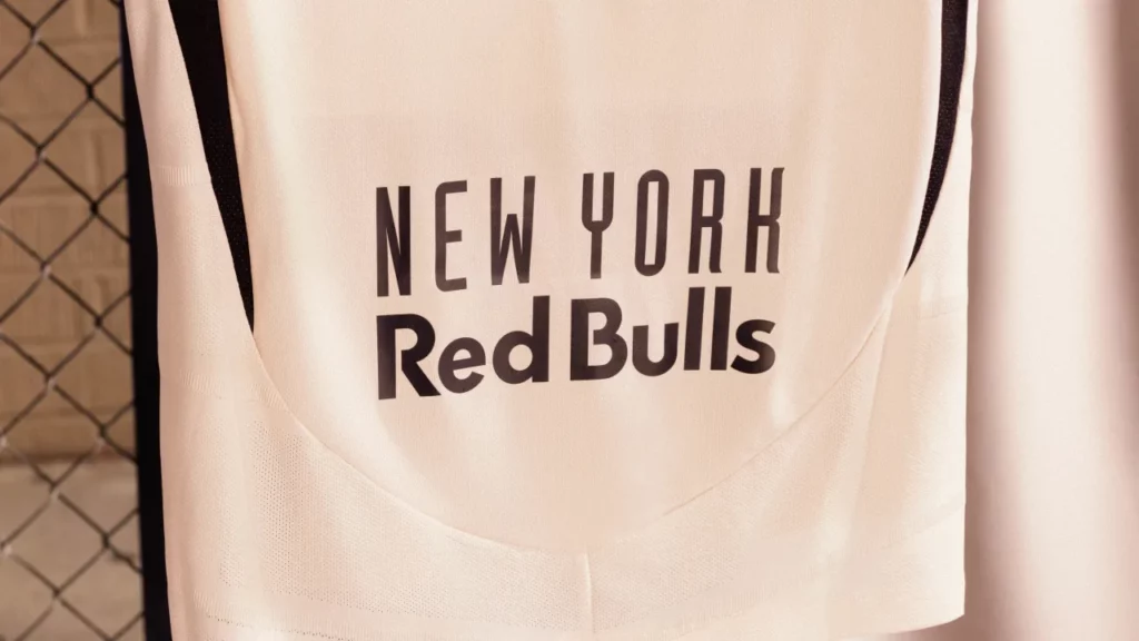
According to the club, the design “is inspired by the architectural grid pattern that originated at Stone Street in Manhattan and embodies the continuous growth of soccer culture across New York and New Jersey’s urban landscape.”

Red Bulls fans deserve better, and Bob Ventimiglia of The Designated Pundits feels the same way, calling the Stone Kit gross.
“It’s ugly,” he said with disdain.
Bob pointed out that there’s an NY at the bottom in the negative space (“if you look closely”), but, ultimately, “It has nothing to do with the club or the metro area,” he said. “It’s not even club colors. It’s an abomination. It’s the worst [kit] we’ve ever had. It feels like it’s as far as a miss as possible. The opposite of what anyone wanted. Ugly. It will sell less than any other kit in club history. That’s a guaranteed fact.”
Damn.
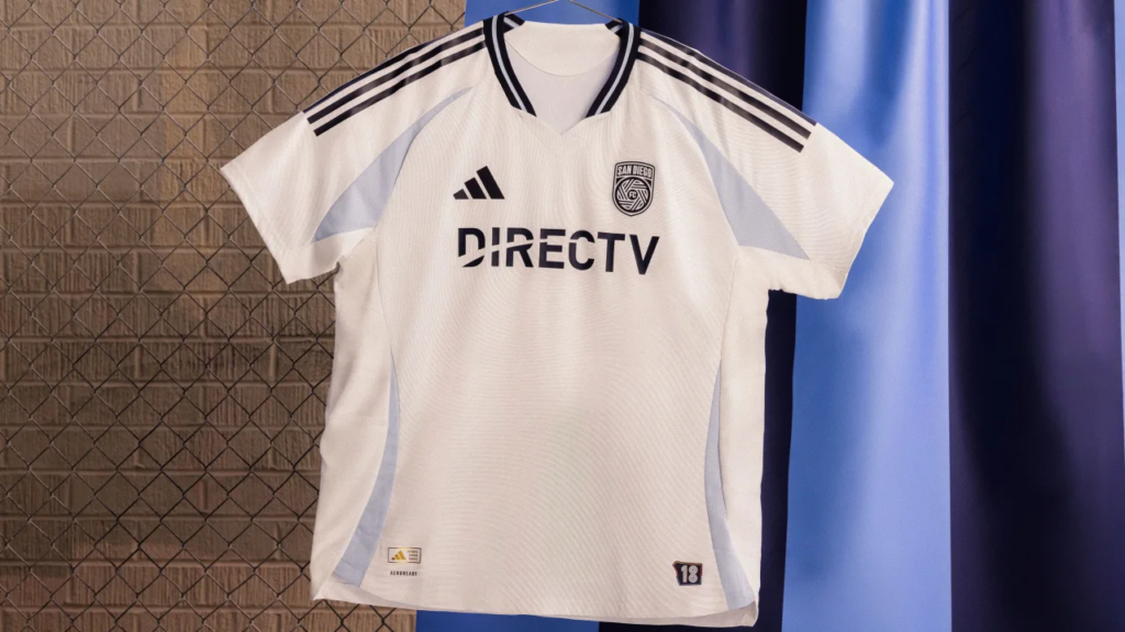
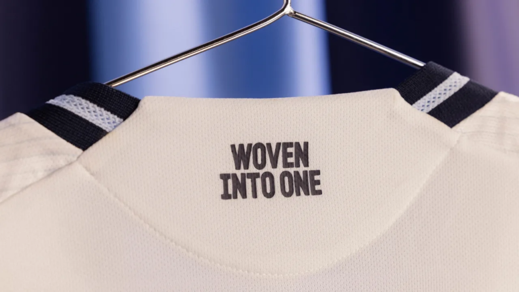
31 / 32 San Diego FC – Woven Into One Kit
In just four seasons of their existence, San Diego Loyal SC (RIP) gifted the world a treasure trove of unique uniforms that became instant classics locally and abroad. It didn’t matter what MLS team you supported, there was nothing wrong with rocking a colorful Loyal jersey, especially those by kit manufacturer Charly.
For their first two seasons, San Diego Loyal did have some pretty basic yet still tasty kits by Adidas, but those were mostly buoyed by the club’s colorful and immediately distinctive logo. Once Charly took over, things really took off.
Wait, hold on… this is supposed to be about San Diego FC’s kits, not the Loyal’s.
Fine. Ugh.
San Diego FC rolled out two of the most insipid kits for their inaugural season. And while their first primary was unveiled way back in December and was met with mixed to poor reception, they waited until the last week of pre-season to unveil a secondary that is nothing special—at all. The Woven Into One Kit is so blank and lifeless that even the new shiny SDFC logo has lost its shine and looks gaunt and flat against a mostly white shirt with light blue accents.
It’s not ugly. But, even with a subtle fingerprint/wave pattern, it’s just bland. Like a tortilla with nothing on it.
SDFC claims that the design is inspired by the club’s mantra, “Woven into one.” (I thought it was “State of flow” …whatever)
Chiva, co-host of the 2 Balls And A Mic Podcast feels the Woven Into One Kit is harmless, although “…there isn’t anything that is uniquely San Diego outside of the outline of the county on the jock tag,” he admitted. “[It’s] a magnet of marketing malapropisms that could have been used for any major city in the country getting a new MLS team. It’s another box checked on the road to launching a team.”
“[This] does not take away from the stellar and great work that individuals made to roll out the content at launch,” Chiva added. “They worked with the identity that is constantly muting how truly vibrant San Diego and its people are.”

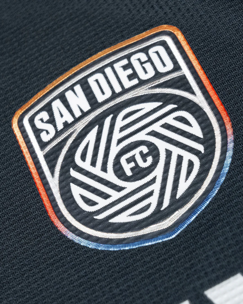
Details include SDFC’s mantra “WOVEN INTO ONE” on the neck, while the jock tag is an outline of San Diego County with “18” representing the “heart of the club,” San Diego’s communities.
30 / 24 San Diego FC – State of Flow
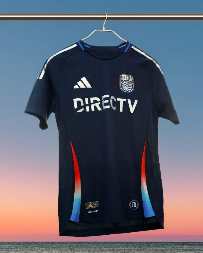
Once again, what a huge, wasted opportunity to make a splash with something that will go down in club lore. Instead, San Diego FC rolled out a training shirt with an entire video production and PowerPoint presentation determined to convince you it’s an actual match kit.
It’s boring. But, unlike the club’s pallid secondary, at least this one has some color, with a gradient that goes from orange to white to blue along the side stripes found on this year’s Adidas template. The base of the kit is “azul,” SDFC’s primary color, with chrome used for the shoulder stripes and Adidas logo.
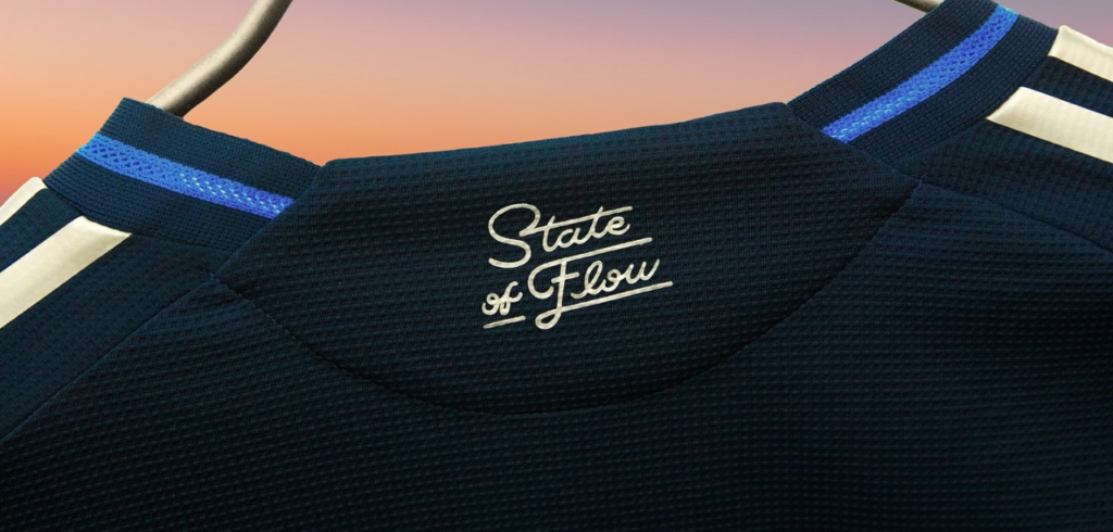
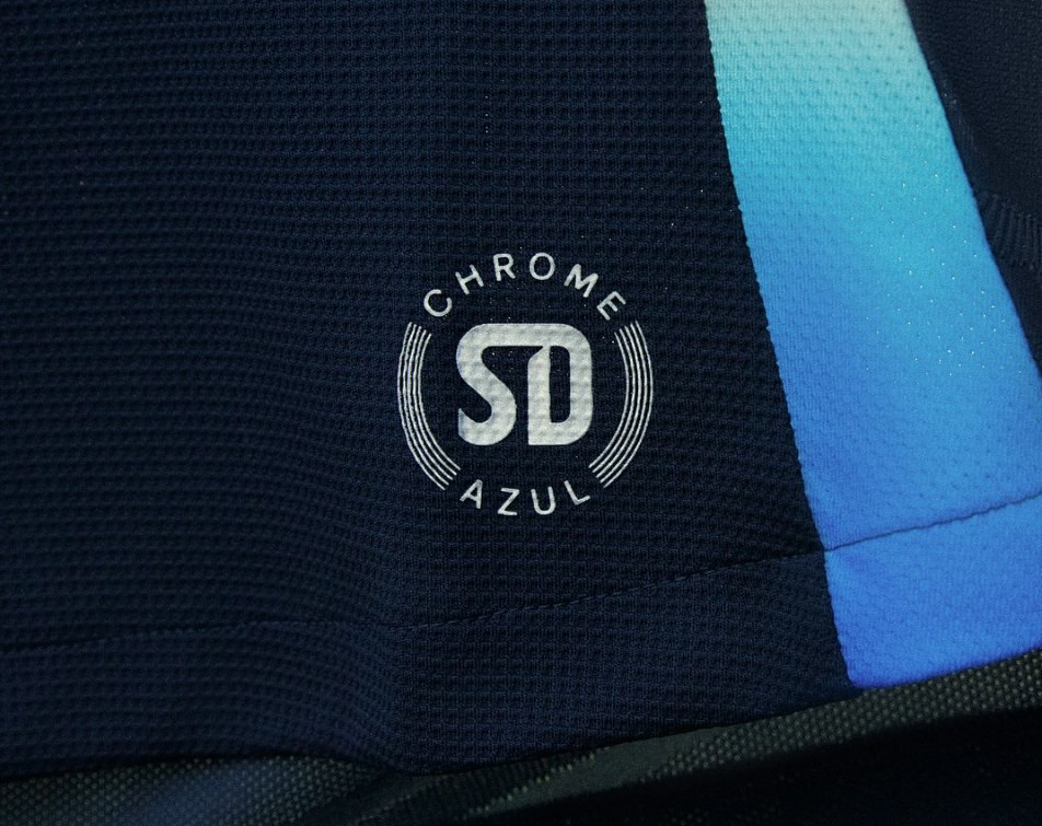
Details include the moniker “State of Flow” in script on the neck, while the jock tag is a circular stamp reading “CHROME” and “AZUL” with and “SD” in the middle.
Altogether, it’s a far, far cry from the old Loyal kits.
Chiva seemed to agree.
“The kit is a very generic template but still looks great,” he said. “It’s a very safe option for San Diego FC. They didn’t take risks with it and the club seems happy about it. [But,] compared to other local clubs, [I’m] not sure if you can compare. Loyal had Charly kits, who are known to create some of the most unique kits in Mexico. [San Diego] Sockers also get very creative with their designs and [San Diego] Wave’s ‘Del Sol’ kit was a one-of-a-kind Nike kit.”
Nevertheless, Chiva is optimistic that the club will have better designs going forward.
“This is not the best or worst kit, it’s just the one they will kick things off with and hopefully use as a launching pad for the future,” he said.
29 / 26 FC Dallas – The Inferno Kit
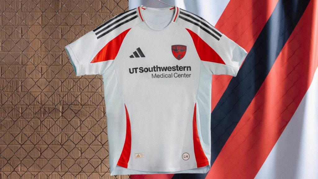
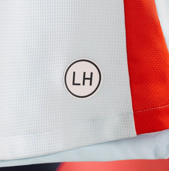
If you’re gonna have a jock tag on your kit honoring the legendary Lamar Hunt, you have to do much better than this. This looks like someone at FC Dallas forgot that they needed to submit a design for a new secondary kit and whipped something up in like 5 minutes and called it a day.
This is one of those kits where the new Adidas template is just not good at all. If you’re going to call this the Inferno Kit, where are the flames? Where is the spice? Slathering red all over the FCD logo probably looked better on the screen because the logo looks like a mess and is barely discernable.
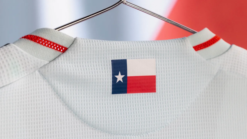
In addition to the usual “LH” jock tag in honor of Lamar Hunt, The Inferno Kit has the Texas state flag on the back, and, well…that’s it. It’s a very simple design. overall. But, sometimes, basic might just work, especially when there’s more than meets the eye.
Jose Tellez, host of Golz TV, prefers a more streamlined design instead of something more intricate.
“My initial reaction is I think it’s a solid kit,” he explained. “I’m a fan of ‘basic’ kits that bring out the colors and tradition of the club, as opposed to a complex design that leaves you wanting more for the sake of ‘being creative.’”
Jose goes on to explain that the overall look of the new FCD strip is combination of inspiration from The Inferno, one of the original FCD supporters’ groups, and paying tribute to the Dallas Tornado, which played in the old NASL from 1967 to 1981, and the Dallas Burn era of the club’s history.
“I think it’s right on par with our previous away kit, which is also an ode to the Dallas Burn,” Jose added. “It’s similar in how simplistic the design is with more incorporation of red (our primary color) and a fresh look for the badge. The only thing that would make it a little better would be to incorporate more of that olive green that the old Dallas Burn fans know too well.”
While the kit can feel a bit generic in some ways to outsiders, as a fan, Jose loves what the club with the badge, claiming that he very much admires the simplicity of the design.
I just have one question. When will FCD go back to hoops? Those FCD hoops kits were awesome.
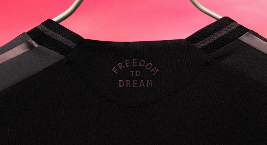
28 / 13 Inter Miami CF – The Fortitude Kit
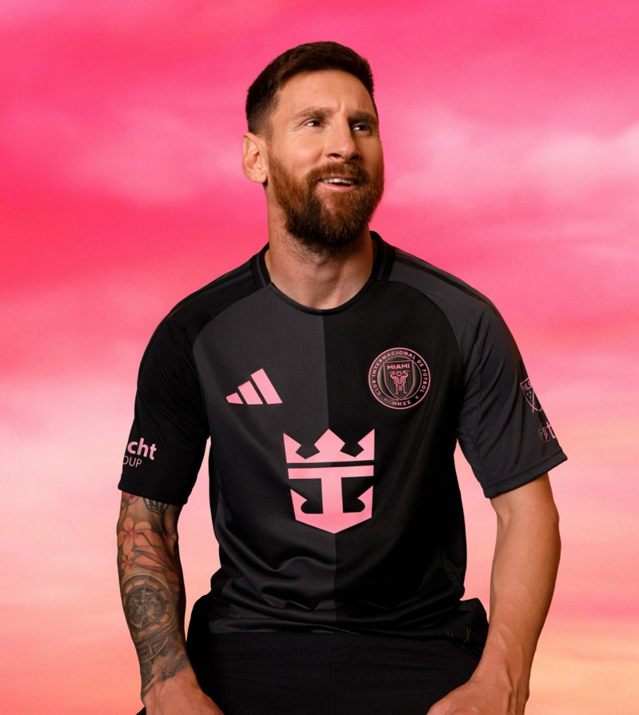
Once the perfectly fine La Noche secondary kit had run its course, Inter Miami CF was set to debut a new design. There was a degree of surprise when the club unveiled The Fortitude Kit right before Christmas but it made dollar sense.
According to the club, “Fortitude” symbolizes the resilience and determination of Inter Miami, their fans, and local community. It’s not a bad shirt. The front is half black and dark gray. The pink of the Miami and Adidas logos really pop. But, once again, what ruins the Miami kits is that large and garish Royal Caribbean logo splayed across the front.
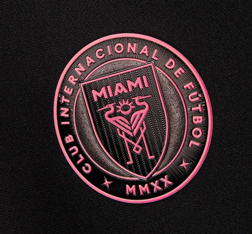
Details include the club’s motto “FREEDOM TO DREAM” in barely discernable dark gray font on the neck and a stylized “M,” also barely there, as the jock tag.
Danny, co-host of the Battered Herons podcast, likes that The Fortitude Kit offers something different since he felt that the last two secondaries looked almost identical. Nevertheless, he admitted that many fans are annoyed by the new design.
“They feel it’s done for Messi because it is similar to past Barcelona and Newell’s Old Boys kits that are split in half with two color schemes,” he explained. “There’s no pride or relation to [Inter Miami] outside of the obvious Messi connection with his old clubs.”
He acknowledged that fans are split over it, with some saying it looks generic and has no tie to south Florida. “I, on the other hand, appreciate a change from the norm and think it’s refreshing to purchase a kit that looks different from all the rest in our short history,” Danny countered. “To my recollection, there aren’t many two-tone road kits in the league. The black and gray with pink accents makes it one of the best road kits this season.”
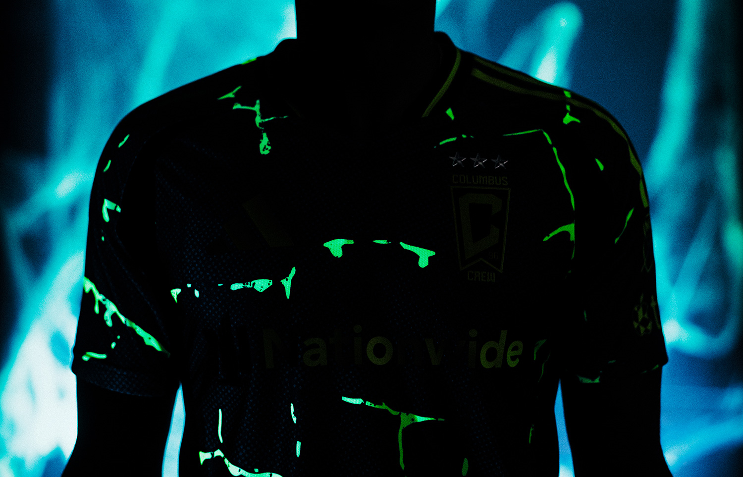
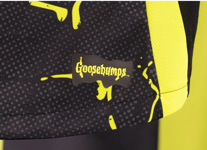
27 / 7 Columbus Crew SC – The Goosebumps Kit
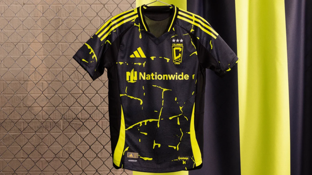
R.L. Stine’s Goosebumps series are beloved by an entire generation that grew up reading his spooky stories aimed at young readers. Kids of my generation grew up reading Stephen King—yeah, for real—so I never really felt inclined to pick up a Goosebumps book, but I understand their mass appeal. But a Goosebumps and MLS mashup is something I never could have imagined.
For 2025, Columbus Crew is honoring local native R.L. Stine by with a strange kit with a spooky design dubbed The Goosebumps Kit. Yeah, for real.
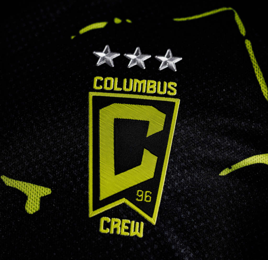
If you’re a fan of the series, you might even say the slimy semi-solar yellow design splattered all over the shirt is monster blood—which glows in the dark when exposed to ultraviolet (UV) light! Columbus Crew is claiming it’s the first kit with that type of technology in the global soccer retail world. How cool is that?
But is it really worth wearing this slimy kit as a secondary for the next two seasons? This design is gonna look great on kids, but adults might think twice before dropping a pretty penny for one of these. But, hey, at least it’ll look great during the Halloween season.
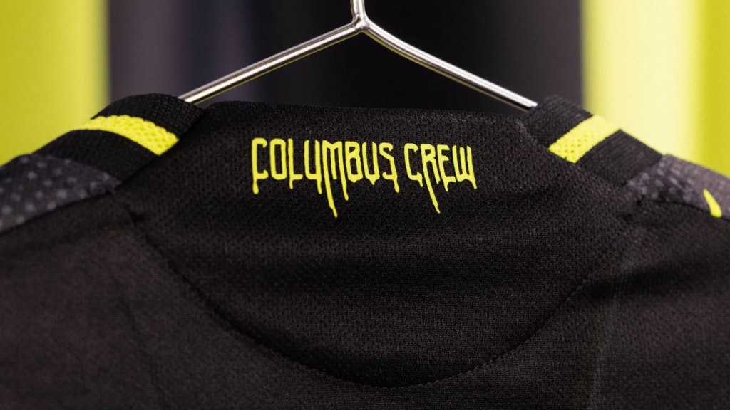
Frightening details include the Columbus Crew name in monster blood on the back of the neck and the familiar Goosebumps logo as the jock tag. Overall, it’s a quaint idea but better reserved for a practice kit or a one-off thing.
Nonetheless, Tyler Fisher, writer for Massive Report, said that the reaction to The Goosebumps Kit was pretty positive.
“Goosebumps is known for its slimy title, and seeing the slime pasted throughout the entirety of the kit is a good touch,” he said. “While it doesn’t evoke pride in the club, it’s sort of a nod to the children’s author and the many tifos that were created for the matches against FC Cincinnati.”
He feels that it’s a minor upgrade compared to previous secondary kits, especially 2021’s grey/white Stadium Kit that the club wore during its inaugural season at Lower.com Field.
“But 2023’s The VeloCITY kit is still the best secondary kit so far, in my opinion,” he admitted.
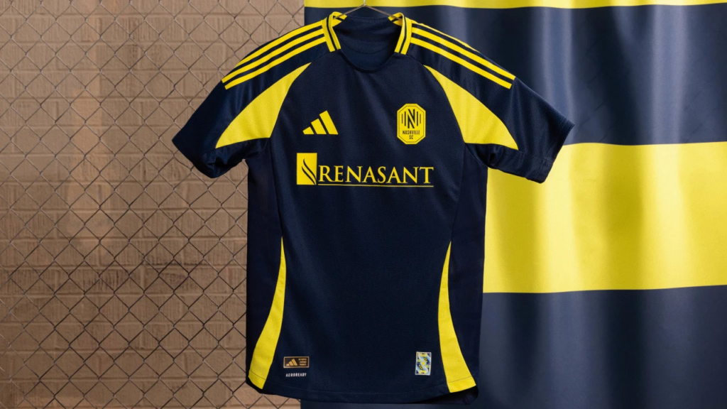
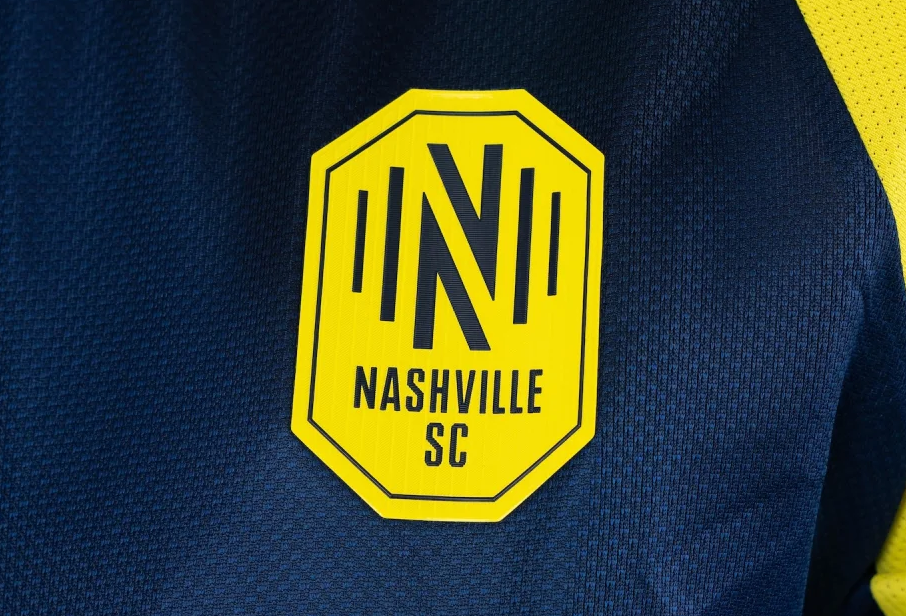
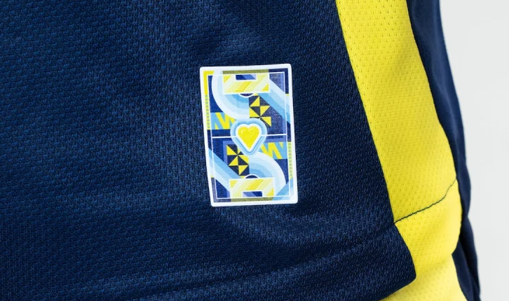
26 / 23 Nashville SC – Heart of Nashville Kit
What a letdown from 2023’s iconic The Man in Black Kit honoring Johnny Cash. There is so much more untapped potential locally in Nashville and from across Tennessee. However, Nashville SC’s newest secondary kit almost seems like an afterthought that was picked out from the Adidas catalogue and had a cute video package thrown together to try to give it some sort of identity.
The club is calling it the Heart of Nashville Kit with an emphasis on the “art” aspect. Yet, you look at this thing and besides the details on the back of the neck and the jock tag, there is nothing that seems artistic about it. It’s not bad, but it’s not good at all, either.
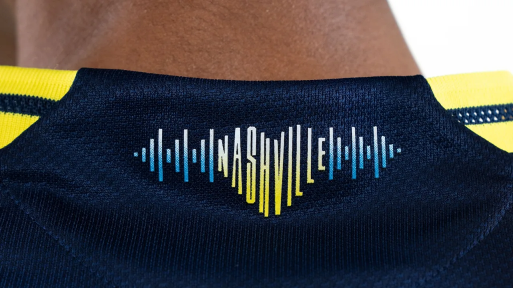
It’s a dark blue base with yellow side stripes and more yellow on the shoulder stripes. The best aspects of this kit are the cool little blue soundwave on the back of the neck, which spells Nashville in the shape of a golden heart, and the jock tag, which is a tiny football pitch with a golden heart at the center, surrounded by flourishes of art.
If only the rest of the kit had more heART. You can be sure this kit will be long forgotten once it has outlived its two-year cycle.
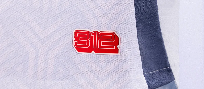
25 / 31 Chicago Fire FC – Municipal Kit

Compared to their bold red primary kit, Chicago Fire’s new Municipal Kit is subdued and bland. And, despite having an iconic local symbol as the inspiration behind its design, like many other kits on this list, it’s another failed opportunity to do something much more significant.
“For the first time in its history, the Fire have incorporated the Chicago Municipal Device into their kit,” explained Nick Glass, who covers Chicago Fire through Glass House Soccer. “Representing the two branches of the Chicago River coming together, this ‘Y’ shaped symbol interlocks throughout the jersey.”
The symbol has been around since 1892, when it was submitted as part of a design in a contest held by the Chicago Tribune to determine the new city flag. Although it did not win, it was officially adopted along with the flag and seal as symbols of the city of Chicago in 1917 and has been incorporated onto civic vehicles and architecture across the city.
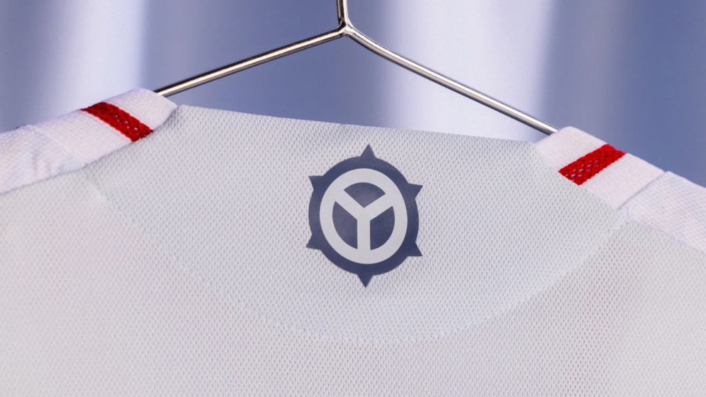
It’s one of those things that once you know about it, you’ll always notice it.
Unfortunately, you can’t really, really see it on the Municipal Kit, which has a very pale, almost eggshell blue, base with darker blue stripes on the shoulders and along the sides.
“While not a color fans are used to seeing, the more subdued blue represents the Chicago waterways while the red accents remind opponents of the Fire they still have to contend with,” Nick added.
Sadly, the Municipal Device pattern is barely there. In fact, this jersey suffers from the same issue as San Diego FC’s Woven Into One Kit in that it’s almost monochromatic, despite a dash of red on the collar and on the jock tag, which features the city of Chicago’s area code in a block-shade font. The Municipal Device, blended with Chicago’s six-pointed star, is found on the back of the neck.
Nick shared that fans have embraced the Municipal Kit and lined up for blocks at the release party to be one of the first to purchase it.
But can you imagine how much more this kit would pop if the Municipal Device pattern on the front was just a few shades darker? The Municipal Kit would stand out as a fresh, new design not yet seen on an MLS kit.
Instead, the Municipal Device pattern is barely there, like this kit.
24 / 12 Minnesota United FC – Convergence Kit
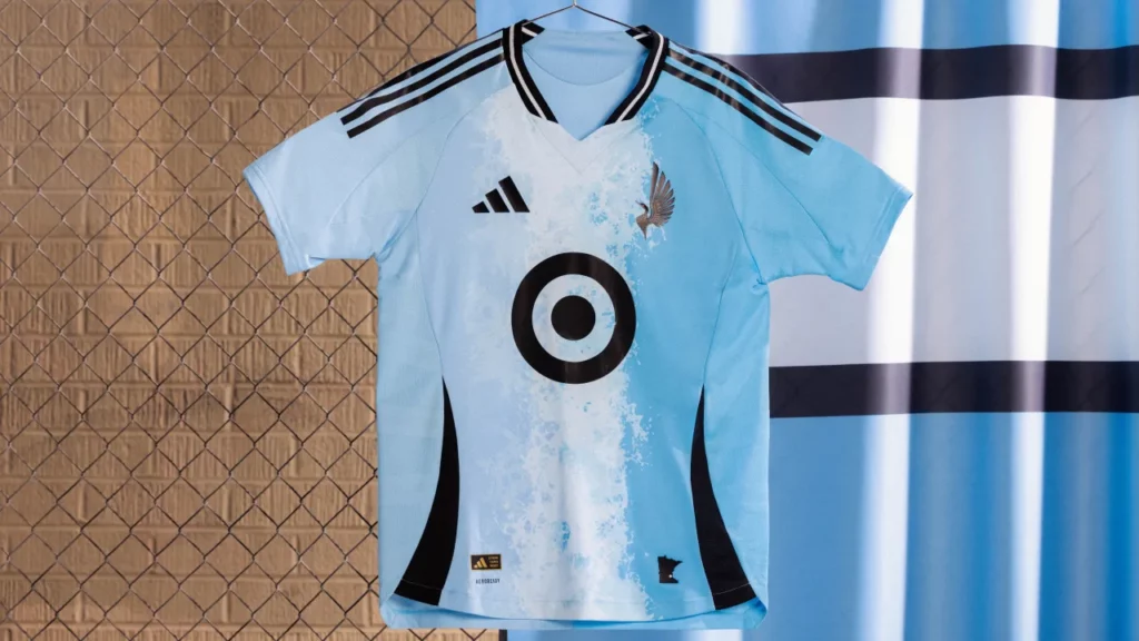
This is another club that took a step back with the design of their new secondary shirt after the well-received Northern Lights kit from 2023. Shifting their focus away from the cosmos, the club from the “Land of a 10,000 Lakes” looked to their sky-blue waters as the inspiration for the Convergence Kit.
The design is supposed to represent the meeting of the Mississippi and Minnesota Rivers, just south of the Twin Cities. In theory it sounds like a decent idea, but the execution… Well, it just looks odd, with two shades of light blue on either side and a large splash of white foam bisecting the kit from top to bottom.
Maybe they could’ve gone with a diagonal design, but FC Cincinnati already tried that with their mediocre The River kit from ’23. Maybe they could’ve gone horizontal, but that would make it look like rapids along a river and the Loons might accidentally summon RapidMan.
Maybe—and I’m just throwing it out there for their next secondary in ’27—the Loons could look to their amazing new state flag (which was adopted in May of ’24) for inspiration.
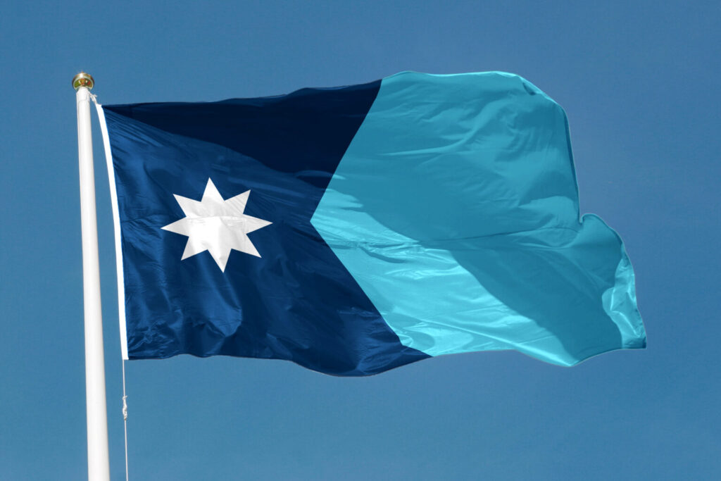
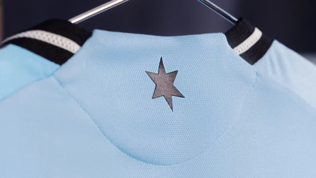
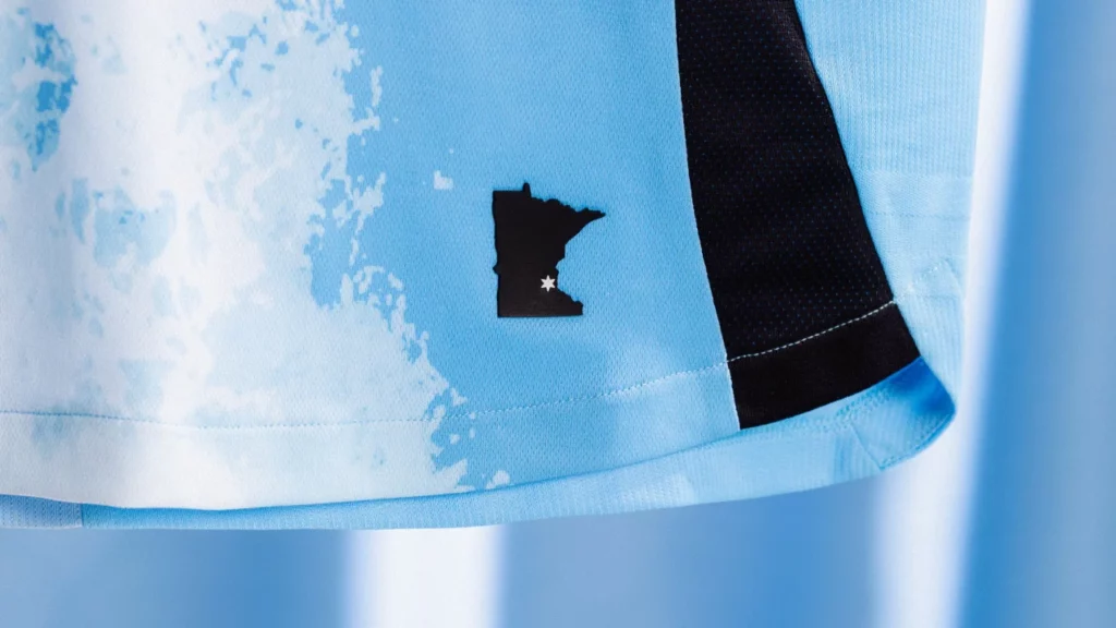
Just like in ’23, the club is using their streamlined secondary Loon logo, which contrasts well with the light blue base. Other details include Minnesota United’s six-pointed star in black on the back of the neck and the jock tag which is a black silhouette of the state of Minnesota with a smaller six-pointed in white over the location of Allianz Field in Saint Paul.
It doesn’t help that the Convergence Kit shares a similar theme and design with the new Colorado Rapids Headwaters Kit, by the way.
“To put it politely, we don’t love it!” declared the fellas from the Loonacy Podcast. “The Northern Lights kit was so much better. I think we understand what message the team was going for, but how could they look at it and not know the jokes were going to come?”
Despite the kit being an homage to Minnesota’s abundant waterways and resources, the Loonacy Podcast guys feel it doesn’t evoke pride, but neither does it feel generic.
“Not gonna lie, there are only two kits so far that I haven’t bought from Minnesota since the beginning of their MLS tenure. This one is probably going to be no. 3,” they admitted.
“I think this is the worst we’ve done,” they added. “I will say it does look slightly better when someone is wearing it but not by much.”
23 / 21 Philadelphia Union – Voltage Kit
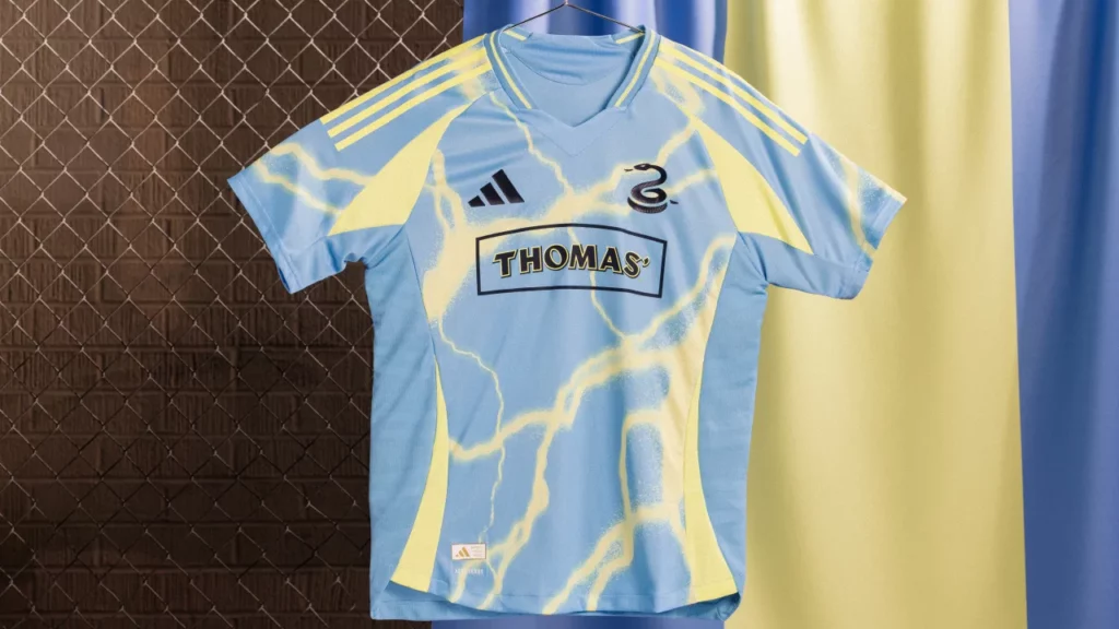
I’m not exactly sure what’s going on here. It seems like Philadelphia Union tried to recreate the magic of the snazzy 2021 BY|U kit, with its lighting bolt pattern. Instead, we got what looks like a strange hybrid of the BY|U and 2023’s For Philly kit.
The lightning motif is a callback to Benjamin Franklin and his experiments with lightning and electricity. “It’s kind of corny, but it’s a staple of Union’s branding,” explained Jimmy King, lead Philadelphia Union writer for the Philly Sports Network. “The colors are also representative of the state of Pennsylvania’s flag.”
However, while trying to replicate realistic lightning bolts crackling across the sky, the design looks more like the ripple reflection from a swimming pool. I can already smell the chlorine.
Jimmy agrees that it’s not exactly Philly’s best, but he does like it.
“While it’s certainly not generic, I think fans view it as the lightning kit 2.0, but just not quite as good,” he said. “I think fans like it a lot more than they’d like a template kit, though. I liked it a lot better once I saw it on the field in photos, and I’m even more excited to see it in person under the lights where I think it’ll really shine.”
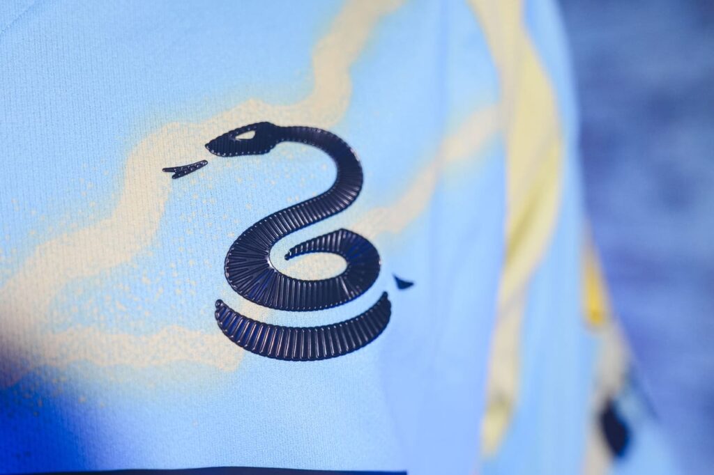
Similar to Minnesota United FC, Philly elected to use a secondary logo for a badge—the familiar Union serpent—with the primary Union logo found on the neck.
While the Voltage Kit is better than the previous secondary, the For Philly kit, which resembled the famous cloudy intro from “The Simpsons,” there’s nothing about it that screams timeless.
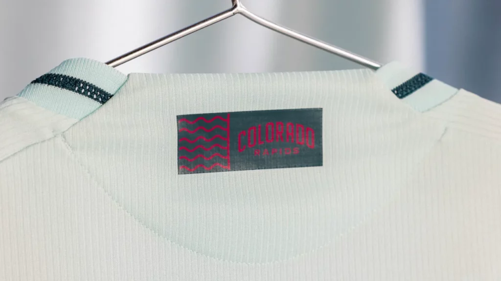
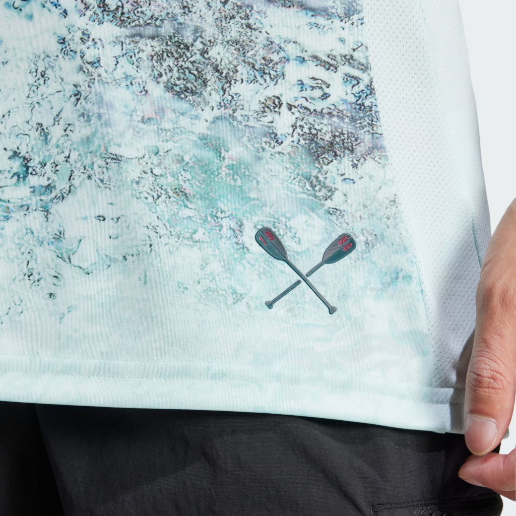
22 / 15 Colorado Rapids – Headwaters Kit
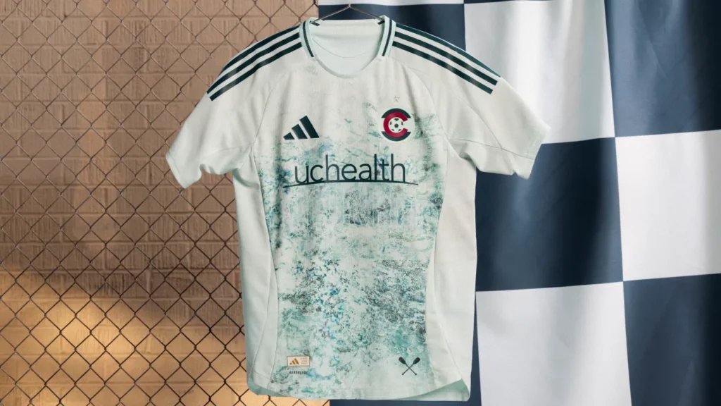
We continue with a recurring theme of something that could have been so much better. It’s a classic case of good idea / bad execution, especially when you compare the Headwaters Kit with previous Colorado Rapids secondary, the kaleidoscopic New Day kit.
Whereas Colorado could have tried to get an artist to depict raging rapids on the front of the jersey, they instead went with a more “realistic” approach and the result is underwhelming. It looks like blue cheese.
And like with those crazy magic eye images that were popular in the late ’90s, if you look very closely you can just make out the club’s name swirling beneath the sponsor logo. At least the color scheme is nice, a mint base with darker green flourishes.
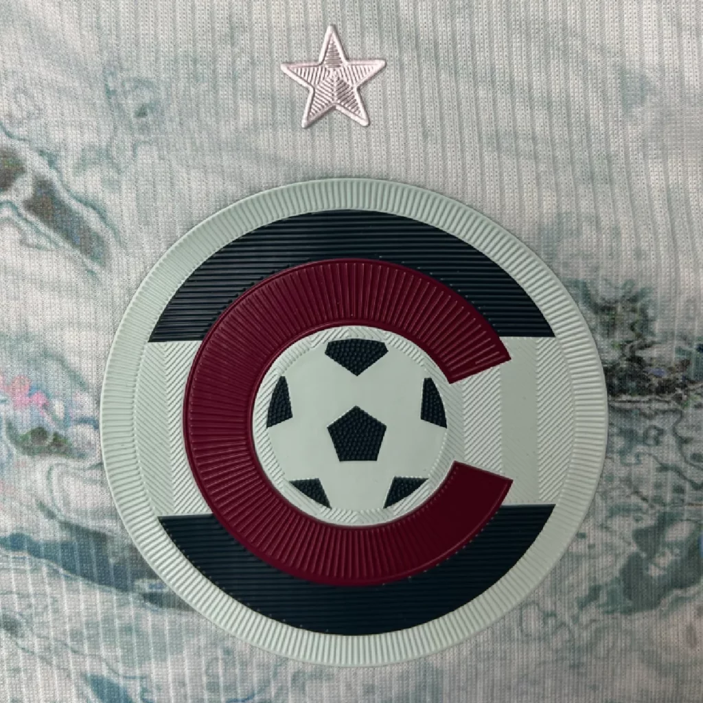
Other details include a cool little water graphic with the club’s wordmark on the neck, while the jock tag is a pair of oars with 19 and 96 to represent the club’s founding year and as ode to the Centennial 38 supporters group. Also, for the first time, Colorado Rapids will use their secondary “C” crest, which incorporates elements of the state flag, but could have been so much better if they had used the peak from the club’s primary logo in the center instead of a more generic soccer ball.
Nevertheless, as part of the Headwaters Kit launch, Colorado Rapids partnered with Colorado Water Trust to help to support 27 projects aimed at improving water flow in rivers across the state.
Matt Pollard, Managing Editor of Burgundy Wave and co-host of the Holding The High Line podcast, feels the Headwaters Kit is a bit monotone, but appreciates the close-up details and the mission behind the shirt.
“It’s a mint green kit overall, which is what we’ve had before,” Matt said. “But the club finally did something that’s Rapids. Much of the branding has been more generic Colorado or mountain themed. ‘It’s time for Rapids,’ as a staffer told me. It’s a kit that looks like a river. I’ll take it.”
Matt also feels it’s not as good as the New Day kit, which he felt had the perfect shade of blue for a Rapids secondary. As far as the Headwaters Kit…
“I’m happy with it,” admitted Matt, adding, “I won’t remember it much in 10 years, compared to the New Day kit. That might change if the Rapids win a road playoff game wearing the Headwaters Kit.”
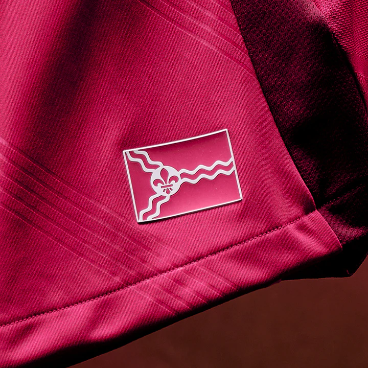
21 / 30 St. Louis CITY SC – Forever CITY Red Kit
For a club that has a solid color palette, in their short history, St. Louis CITY SC has yet to put out a kit that can be viewed as a definitive representation of the city’s history and culture, but it isn’t for lack of trying.
After making a good first impression with the inaugural CITY Kit, STL has taken a big step back with the largely monochromatic Forever CITY Red Kit. At least it’s red. Red on red on red.
It does have one unique design element that is only noticeable when light hits the shirt at the right angle, or you get close enough to inspect it. Five embossed diagonal lines found across the shirt serve as a tribute to the five players from St. Louis’ The Hill neighborhood who played on the 1950 U.S. Men’s National Team World Cup team, which shocked England 1-0 in one of the greatest World Cup upsets of all time.
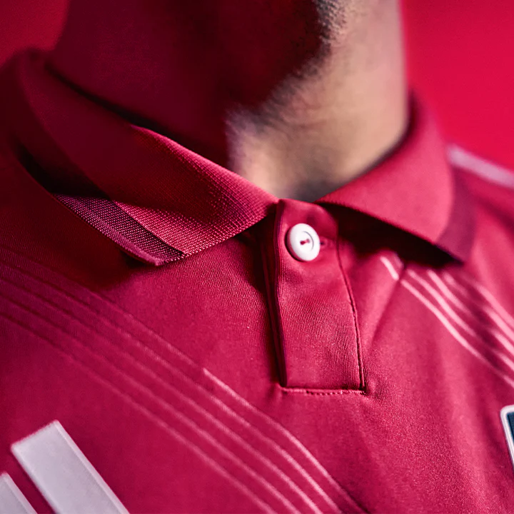
Another distinctive feature is that the Forever CITY Red Kit is one of only two of the new batch of MLS kits to have a polo collar, the other being LAFC’s Secondary Kit. The collars might look nice (if you’re into that look) but tend to pop up during play.
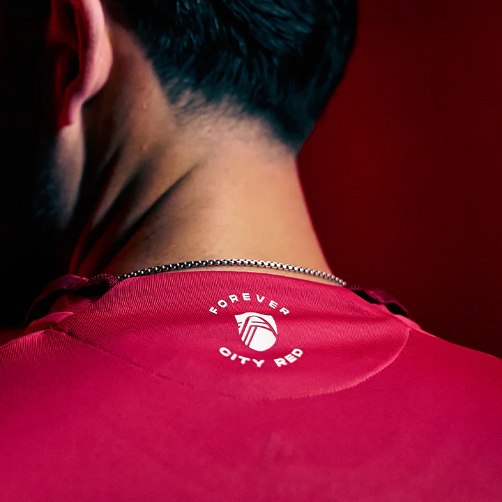
Other details include a “Forever CITY Red” seal on the neck and a completely red version of the flag of St. Louis for the jock tag.
“Initially, I saw it in a replica sporting goods store leak and was underwhelmed,” said Matt Baker, co-host of the Flyover Footy podcast. “Seeing it in person, it looks much classier. It’s simple and elegant while cementing our core identity/color of CITY Red—a unique color in general. The understated five sashes look slick in person, and I’m surprised how much I actually like the half collar.”
However, he did feel the club might have done better with the design.
“It’s a bit generic, other than diving into the unique color,” he admitted. “The choice to not use secondary club colors was a bold choice that’s leaving a lot of fans feeling underwhelmed. It’s hard to top your first and I think the club hit it out of the park on the first home kit, but I like it better than either secondary kit we’ve had so far.”
With the club honoring the five St. Louis players on the ’50 US World Cup team, Baker feels it’s a “past meets future type of thing” and loves “the nod to the 75th anniversary of one of the most iconic and best stories of soccer that St. Louis has to tell.”
What do you think about this first group? Are there any kits that you think deserve to be higher on the list? Things start to get better in the next group (20-11), but there’s no comparison to the designs from the previous three years.
Coming soon, No. 20-11!
Related Post

The 2024 MLS Kit Golden Age, Part 2
By Edgar Zuniga After a few duds from the bottom of the ranking, it got [...]
The 2023 MLS Kit Renaissance
By Edgar Zuniga After several years of Adidas giving us banger after banger of plain [...]